
IELTS THƯ ĐẶNG- TRUNG TÂM LUYỆN THI IELTS UY TÍN, CHẤT LƯỢNG TẠI HÀ NỘI
Tham khảo các bài liên quan:
>>> Kinh nghiệm luyện thi IELTS
>>> Hướng dẫn làm bài thi IELTS
15 DẠNG BÀI BAR CHART TRONG IELTS WRITING TASK 1
Trong bài viết này, IELTS Thư Đặng sẽ tập trung vào các nguyên tắc cơ bản mà bạn nên biết để hoàn thành tốt phần Writing task 1 trong IELTS học thuật, đặc biệt là Task 1 và cách mô tả biểu đồ Bar Chart trong Academic IELTS.
Ngoài ra, bạn sẽ tìm thấy 15 bài tập biểu đồ thanh IELTS Writing task 1 gần đây với các bài mẫu đi kèm do IELTS Thư Đặng tổng hợp.
IELTS Writing Task 1
Trong phần Writing này, bạn sẽ phải mô tả một số loại thông tin trực quan. Nó có thể là các dạng bài:
- Pie Chart;
- Line Graph;
- Bar Graph;
- Table;
- Process Diagram;
- Map;
- Combination of several visuals (e.g. Pie Chart + Table).
LÀM THẾ NÀO ĐỂ MÔ TẢ BÀI VIẾT Ở DẠNG BAR CHART?
Bất kể bạn được đưa ra hình ảnh nào trong phần này của bài kiểm tra, bạn luôn phải tuân thủ các quy tắc sau khi hoàn thành Bài tập Writing Task 1:
Tốt hơn là chỉ nên tập trung vào các đặc điểm quan trọng của biểu đồ. Bạn không nên cố gắng đưa ra lý do cho các yếu tố được hiển thị trong biểu đồ hoặc mô tả mọi chi tiết.
Khi bắt đầu câu trả lời, bạn nên viết phần giới thiệu bằng lời của mình bằng cách sử dụng thông tin từ câu hỏi và các tiêu đề.
Sau phần giới thiệu, bạn cần viết một cái nhìn tổng quan ngắn gọn về các đối tượng và mục đích của chúng.
Trong các đoạn nội dung, bạn nên tập trung vào cách thức hoạt động của đối tượng hoặc những điểm tương đồng và khác biệt đáng kể giữa các đối tượng.
Cố gắng sử dụng nhiều từ vựng và cấu trúc. Bạn nên biết một số từ vựng cụ thể để mô tả biểu đồ thanh và đồ thị. ví dụ. từ vựng cho những thay đổi (tăng, giảm, tăng, v.v.)
Đừng bày tỏ ý kiến của bạn! Tránh sử dụng những cụm từ như tôi nghĩ, như chúng ta có thể thấy, theo ý kiến của tôi, v.v.
15 BÀI MẪU IELTS WRITING TASK 1 [ BAR CHAT] GẦN ĐÂY
Bar Chart Sample 1.
You should spend about 20 minutes on this task.
The diagram below shows the number of landline telephones per 1000 people in different countries over a five-year period.
Write a report for a university lecturer describing the information shown below.
Write at least 150 words.
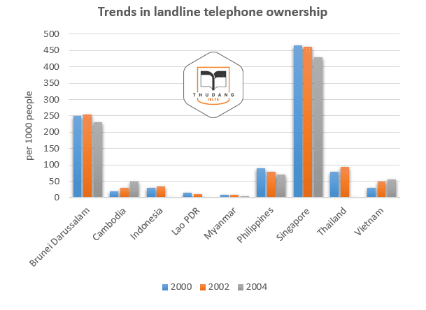
Model answer:
The graph shows the number of telephones owned per thousand of the population in different countries over a five-year period. Overall, the number of phone owners per thousand of the population varied considerably. However, numbers tended to fall in countries with the highest level of phone ownership, whereas numbers generally rose in countries which had fewer phone owners in 2000.
By far the highest level of phone ownership was in Singapore, where just under 430 people per thousand were owners in 2004. This figure is slightly lower than the 2000 figure of around 460 per thousand. In Brunei Darussalam the second highest levels of phone ownership were recorded, and the numbers fluctuated around the 250 per thousand level across the five years. Countries like Cambodia and Vietnam had much lower levels of phone ownership and these increased up to 2004, rather than decreasing. In the remaining countries, the number of landline phone owners remained below the 100 per thousand level between 2000 and 2004.
(164 words) |
Bar Chart Sample 2.
You should spend about 20 minutes on this task.
The bar chart below shows the percentage participation of men in senior development in three companies between 1980 and the year 2010.
Summarise the information by selecting and report in the main features, and make comparisons where relevant.
Write at least 150 words
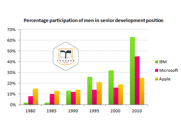
Model answer:
The bar chart shows the percentage of men in senior development position in three companies from 1980 to 2010.
While more men were in senior positions at Apple than other two companies in 1980 at 15%, the trend was fairly erratic with a 2% drop to 13% in 1985, followed by a rise of 1% five years later. In 1995, men held 7% more top development jobs than in 1990. After a slight drop back to 19% in 2000, by 2010 25% of top posts were filled by men.
By contrast, at IBM men fared much better. In 1980, 2% of senior posts were occupied by men with no change five years on. By 1990, the figure had increased to 13%, doubling to 26 per cent in 1995. Five years afterwards, there was a 6% increase in male senior development jobs with a near twofold jump in 2010 to stand at 63%, the highest for the three companies.
The situation was less remarkable at Microsoft than the other two firms except for the year 2010. In 1980, the percentage of senior posts held by men was 8% climbing at the rate of 2% in each subsequent period until 2000, after which it leapt to 45%. From the data, it is clear that men dominated senior posts at IBM by 2010. |
Bar Chart Sample 3.
You should spend about 20 minutes on this task.
The bar chart shows the number of overseas students enrolled in a third year Computer Science course at a Canadian college.
Summarise the information by selecting and report in the main features, and make comparisons where relevant.
Write at least 150 words
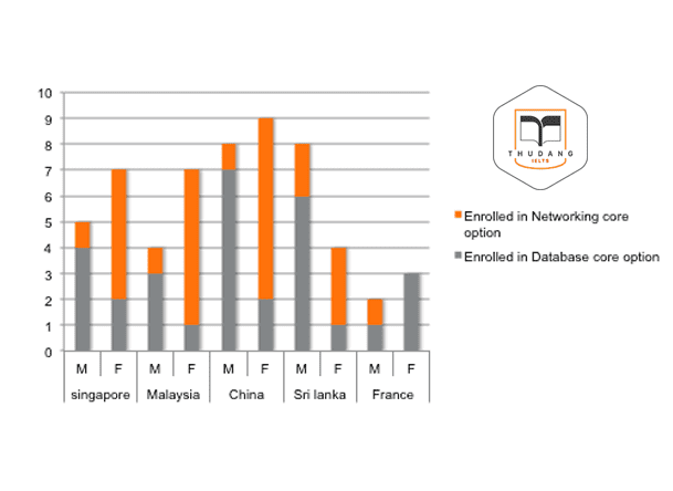
Model answer:
According to the bar chart, students from four Asian countries (China, Singapore, Malaysia and Sri Lanka) and one European country (France) are taking Computer Science at the collage. Some students are enrolled in the Database core option; the others are taking Networking.
Overall, the China has the largest number of enrolled students (17) and France has the smallest (5). Singapore and Sri Lanka both have 12 students; Malaysia has 11. It is noticeable that Singapore and Sri Lanka have similar profiles.
Students from all five countries are enrolled in Database, but more males are taking this option than females (21 and 9 respectively). For each nationality, the males taking Database outnumber the females, except in the case of French students with 3 females to only 1 male. The China has the most students studying Database (9); Sri Lanka is next with 7, while Singapore has 6. Malaysia and France have 4 Database students each.
As for Networking option, more females than males are enrolled from every country except France. In fact, no female French students are taking Networking. Only 1 male from each country is enrolled in Networking, except for 2 males from Sri Lanka. |
Bar Chart Sample 4.
You should spend about 20 minutes on this task.
The diagram below shows the number of houses built per year in two cities, Derby and Nottingham, Between 2000 and 2009.
Write a report for a university lecturer describing the information shown below.
Write at least 150 words.

model answer:
The bar chart describes the number of houses built in two neighboring cities, Derby and Nottingham, Between 2000 and 2009.
Overall, the number of houses that were erected in Derby exceeded upwards the quantity constructed in Nottingham. The trend for the former was decidedly upwards, with Derby experiencing a steady rise from 40 new houses in the first year, to just under 120 during the 2003. Over the next 4 years of decade, new houses construction in Derby remained constant at just under 120. This is in sharp contrast to the last two years when the number of houses that went up in Derby leapt, first to 280 and then to 350 houses.
Houses building in Nottingham, by comparison, was much more erratic. In the first two years of the decade, more houses were erected in Nottingham than in Derby. In 2002, however, construction declined to only 20. Over the next three years, houses numbers rose steadily, only to drop practically to zero in 2006. There was then a dramatic surge in 2007 with over 200 houses being built. While in 2008 saw house building in Nottingham plummeting to only 10, in 2009 the number of new houses rocketed to 270, a rise of more than 2600 % on the previous year.
(212 words) |
Bar Chart Sample 5.
Another IELTS writing task 1 exercises for Academic module and you should spend about 20 minutes on this task.
The bar chart shows the number of visitors to three London Museums between 2007 and 2012.
Summarize the information by selecting and reporting the main features, and make comparisons where relevant.
Write at least 150 words
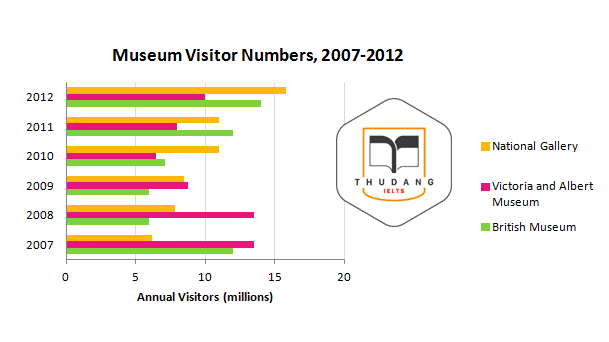
model answer:
The bar chart illustrates information about how many people per year visited three London museums over six-year period from 2007 to 2012.
Overall, what stands out from the graph is there was gradual upward trend in the number of visitors of the National Gallery, which became the most popular museum from being at last place, while the Victoria and Albert Museum followed the opposite trend. In detail, in the first two years of the period, the number of visitors of Victoria and Albert Museum remained stable at 13.5 million, and then fell to 9 million in 2010, while that of British Museum, dropped significantly by 50%, from 12 million to 6 million and remained at this level in 2009.
However, there was gradual upward trend in the number of visitors of both British Museum and Victoria and Albert from 2010 to 2012, the former number doubled and the latter rose by more than 50%, finishing at 14.5 and 40 million respectively. In addition, there was significant increase of the number of visitors of National Gallery over the whole six-year period, the figure finishing at almost 16 million.
(184 words) |
Bar Chart Exercise 6.
You should spend about 20 minutes on this task.
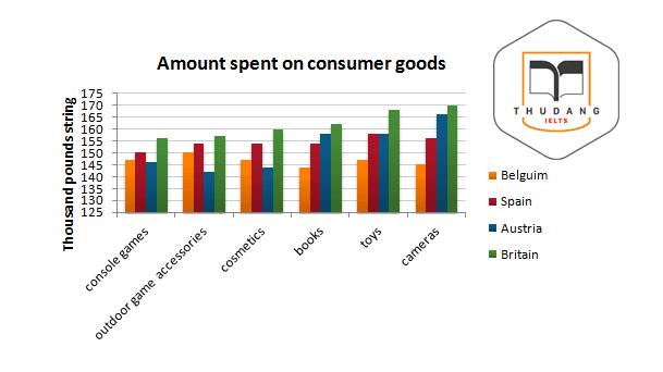
The bar chart below give information about five countries spending habits of shopping on consumer goods in 2012.
Summarize the information by selecting and reporting the main features, and make comparisons where relevant.
Write at least 150 words.
model answer:
The chart compares the spending habits of shoppers in five European countries on six consumer products, namely console games, outdoor game accessories, cosmetics, books, toys and camera. Overall, more money was spent on the latter two than on any other product.
It can be observed that in Britain, the highest amount of money was spent on camera (more than 160 million pounds), while similar amounts were spent on console games and outdoor game accessories. The Austrian spent the second highest amount of money on the first three products while they stood last in the latter three. It is also revealed that Spanish spent more money on toys than on any other product (a bit less than £150 million), but they also paid a lot for camera. Finally, Belgian spent the least overall, having similar spending figures for all 6 products compared in the bar chart.
To sum up, the British were the biggest spenders in all six categories among the nations compared in the bar chart while the lowest spending levels were attributed to the residents of Belgium.
(178 words) |
Bar Chart Sample 7.
You should spend about 20 minutes on this task.
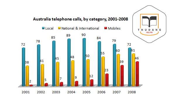
The bar chart below shows the total number of minutes (in billions) of telephone calls in Australia, divided into three categories, from 2001- 2008.
Summarize the information by selecting and reporting the main features and make comparisons where relevant.
Write at least 150 words.
model answer:
The chart shows the time spent by Australian resident on different types of telephone calls between 2001 and 2008.
Local fixed line calls were the highest throughout the period, rising from 72 billion minutes in 2001 to just under 90 billion in 2003. After peaking at 90 billion the following year, these calls had fallen back to the 2001 figure by 2008.
National and international fixed line calls grew steadily from 38 billion to 61 billion at end of the period in question, though the growth slowed over the last two years.
There was a dramatic increase in mobile calls from 2 billion to 46 billion minutes. This rise was particularly noticeable between 2005 and 2008, during which time the use of mobile phones tripled.
To sum up, although local fixed line calls were still most popular in 2008, the gap between the three categories had narrowed considerably over the second half of the period in question.
(157 words) |
Bar Chart + Pie chart Sample 8.
You should spend about 20 minutes on this task.
The IELTS Writing task 1 exercise graphs show figures relating to hours worked and stress levels amongst professionals in eight groups.
Describe the information shown to a university or collage lecturer.
Write at least 150 words

model answer:
Two graphs give different information related to eight professional groups. The bar chart indicates the number of weekly work hours done by the groups while the pie graph illustrates the percentages of people suffering from stress related illness in the different professions given.
In general, business men work the longest among the eight groups while the smallest amount of time is normally worked by lecturers. According to the pie chart, lecturers struggle the most with work-related stress. Although their average working hours is smaller than any other group in the chart, lecturers suffer from the highest level of stress caused by their job.
The bar graph shows that business men and movie producers work the most at about 70 hours and 62 hours per week respectively. At the opposite end of the scale, lecturers work only around 25 hours. Working hours of other professionals varied with doctors, writers, programmers, lawyers and chefs working approximately 52, 46, 35 and 32 hours per week in the name ordered.
The pie graph shows that the professional who has the highest incidence of stress related illnesses is lecturers at 25%. Movie producers and doctors also have high rates with 18% and 15% each. The figures for business men, lawyers, chefs and writers can be grouped into percentages between 11 and 8%. The lowest rate of stress illness is attributed to programmers at only 5%, which is only a fifth the figure for lecturers.
(239 words) |
IELTS WRITING TASK 1 EXERCISES
Bar Chart 9
You should spend about 20 minutes on this task.
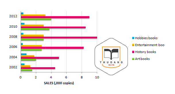
The bar graph indicates sales figures for reading materials from 2002 to 2012.
Write a report to a university lecturer describing the information shown below.
Write at least 150 words
model answer:
The graph shows the changes in the sales of four different types of publications for a decade since 2002.
In general, all the given categorise except hobbies book showed a rising trend in the sales over the period. The sales of history books were the highest while those of art books were the lowest.
In particular, the sales of the biggest sellers, history books, experienced an overall growth during the period. The sales were around 4500 copies in 2002, and then reached a peak of 10000 in 2008. Although the figure dropped slightly after then, history books remained the greatest sellers with around 9000 copies sold in 2012.
The sales of art books and entertainment books showed a similar pattern of a steady growth. The figure for art books increased slowly from around 1500 copies in 2002 to just under 4000 in 2012 while that for entertainment books went through a moderate rise from approximately 1300 copies in 2002 to 3000 in 2012.
On the other hand, the last category, hobbies book, did not show an upward trend. The sales of hobbies book showed the lowest sales figures, and the figure generally remained constant at between 500 and 700 copies.
(199 words) |
Bar Chart 10.
You should spend about 20 minutes on this task.
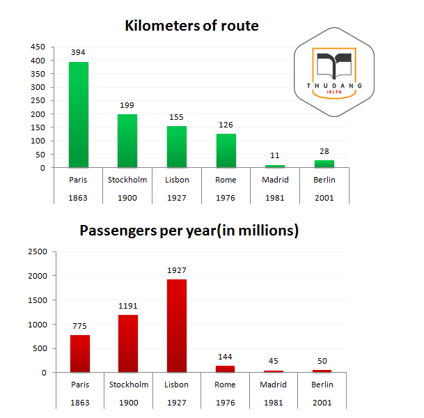
The bar charts below give information about the railway system in six cities in Europe.
Summarise the information by selecting and reporting the main features, and make comparisons where relevant.
Write at least 150 words.
model answer:
The bar charts illustrate comparable information related to railway systems in six capital cities in Europe; Paris, Stockholm, Lisbon, Rome, Madrid and Berlin.
In general, railway systems in different cities vary in terms of the start dates of each system, the sizes, and the numbers of passengers using the systems in a year.
As far as the ages are concerned, Paris has the oldest railway system among the six cities. It was opened in the year 1863, which is incomparable to the other cities. On the other hand, Berlin has the newest railway system which was opened in Europe 2001.
In terms of the sizes, Paris, for certain, has the longest route, 394km, which is nearly twice the figure for Stockholm. Madrid, in contrast, has the shortest route in its railway system, only 28km.
When it comes to the numbers of people using the railway system in each, Lisbon shows the largest number of 1927 million passengers in a year while Madrid serves the smallest number of railway users, 45 millions.
(170 words) |
Bar Chart 11.
You should spend about 20 minutes on this task.
The bar graph below shows the numbers of male and female research students studying six computer science subjects at a US university in 2011.
Summarise the information by selecting and report in the main features, and make comparisons where relevant.
Write at least 150 words
model answer:
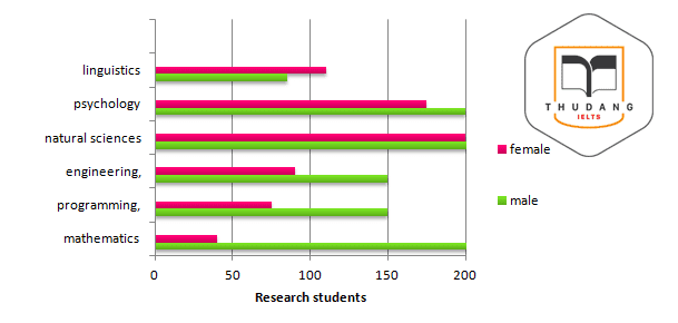
The bar chart shows the gender distribution of students doing computer scientific research across a range of disciplines at a US university in 2011.
In five of the six disciplines, males outnumbered females. Male students made up a particularly large proportion of the student group in subjects related to the study of programming objects: mathematics, programming, and engineering. The gender gap was particularly large in the field of mathematics, where there were five times as many male students as female students.
Men and women were more equally represented in subjects related to the study of computer science: natural sciences, psychology, and linguistics. In natural science, there were nearly as many women [approximately 200] as men [approximately 240]. This was also true of psychology. Linguistics was the only discipline in which women outnumbered men [roughly 110 women vs. 90 men].
Overall, the chart shows that at this university, computer science subjects continue to be male-dominated; however, women have a significant presence in fields related to psychology and the computer sciences.
(169 words) |
Bar Chart 12.
You should spend about 20 minutes on this task.
The graph gives information about drinking habits of the US population by age.
Summarize the information by selecting and reporting the main features, and make comparisons where relevant.
Write at least 150 words
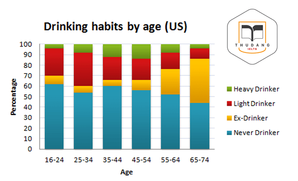
model answer:
The bar chart shows information about people’s drinking behavior by age group in the US. Several trends are evident. The highest proportion of those who never drink (nearly two-thirds) was in the 16 to 24 years group. The proportion tended to decrease with age. Only 40 per cent of people aged 65 to 74 had never drink. On the other hand, the percentage of those who had quit drinking tended to increase with age. Only 5 per cent of those in the youngest age group (16 to 24) were ex-drinkers, as opposed to roughly 40 per cent of those aged 65 to 75. The percentage of those classed as heavy drinkers also showed a distinct pattern. People in middle age (35 to 54) tended to be the heaviest drinkers – approximately 13 per cent of the total. A relatively small proportion of those in the youngest age group, and an even smaller percentage of those in the oldest group (roughly 3 per cent) drink heavily. Overall, age appears to be a significant factor in patterns of drinking behavior. (177 words) |
Bar Chart 13.
You should spend about 20 minutes on this task.
The bar chart shows different methods of waste disposal in four cities; Toronto, Madrid, Kuala Lumpur and Amman.
Summarize the information by describing the main features of the chart and making comparisons where appropriate.
Write at least 150 words
model answer:
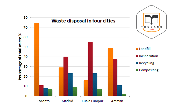
The bar chart depicts four types of waste disposal in four cities. Landfill was the most popular method of waste disposal in Toronto and Amman. Toronto used landfill for disposing of about three-quarters of its waste with the remaining quarter split between incineration, recycling and composting.
Amman used landfill for disposing of almost half of its waste with most of the rest being incinerated. Incineration was the most popular method of waste disposal in Madrid and Kuala Lumpur.
Kuala Lumpur disposed of more than half its waste by incineration with less than one quarter going for recycling and even less still going for landfill and composting. Recycling was the second least popular method of waste disposal.
No cities disposed of more than 25% of its waste by recycling and in the case of Toronto, it was less than 10%. Composting was the least common method of waste disposal. No cities disposed of more than 10% of its waste by compositing and Amman hardly did any composting.
(166 words) |
Bar Chart 14.
You should spend about 20 minutes on this task.
The chart below gives information about global population percentages and distribution of wealth by region.
Summarise the information by selecting and reporting the main features, and make comparisons where relevant.
Write at least 150 words
model answer:
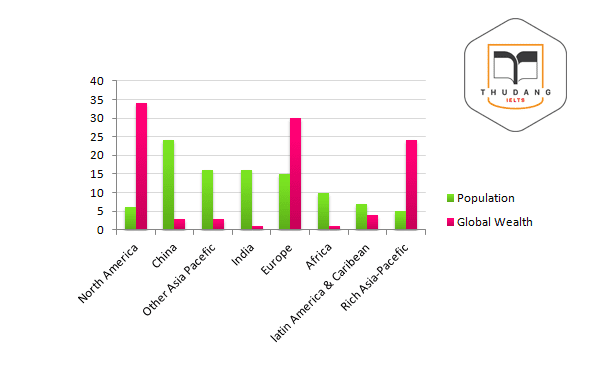
The chart compares population shares in various regions of the world with the distribution of wealth in these same regions. It can be seen that population shares in almost all cases do not relate to the distribution of wealth.
Even though North America has only approximately 6% of the world’s population, it boasts nearly 34% of global wealth. A similar situation can be seen in Europe, which has 15% of the global population but 30% of global wealth, and the rich (high income) Asia-Pacific countries with 5% of the world’s population but 24% of its wealth.
On the other hand, the total wealth of people in China, India, Africa, Latin America and Caribbean, and the other poor (lower income) countries in Asia-Pacific is far less than their shares of the world population. This is most striking in India, where 16% of the world’s population own only 1% of the world’s wealth and in China, which has the highest percentage of global population (24%) but only 3% of the world’s wealth.
(170 words) |
Bar Chart 15.
You should spend about 20 minutes on this task.
The bar charts below show the Marriage and Divorce Statistics for nine countries in 1981 and 1994.
Write a short report for a university lecturer describing the information shown below.
Write at least 150 words
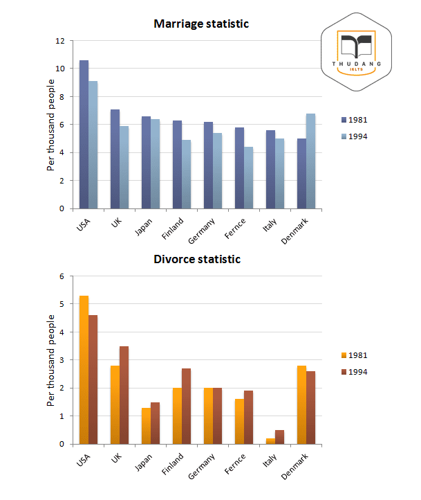
model answer:
As we can see from the information, there was a general trend for the number of marriage to decrease over 13 years in most of the countries. In 1981, the USA had the most marriages (10.6 per thousand) but by 1994 this had fallen to 9.1 per thousands. The number of marriages also fell substantially in Finland and France. The only country where there was an increase in the number of marriage was Denmark.
By comparison the rate of divorce increased in most countries over the same period. The only exceptions to this trend were Germany, where there was no change, and the USA and Denmark, where the figure fell. The country with the fewest divorce in both 1981 and 1994 was Italy.
(123 words) |
Ngoài ra các bạn có thể tham khảo thêm một số tài liệu được IELTS Thư Đặng tổng hợp tại thư mục: http://ielts-thudang.com/download
Trân trọng cảm ơn các bạn!
Ngoài ra các bạn có thể tham khảo thêm rất nhiều nguồn tài liệu khác ở các thư mục của Website:
IELTS - Thư Đặng Tổng hợp!
.png)
Thân mến,
IELTS THƯ ĐẶNG
 ĐĂNG KÝ KIỂM TRA ĐẦU VÀO - TƯ VẤN MIỄN PHÍ
.png)