


IELTS THƯ ĐẶNG- TRUNG TÂM LUYỆN THI IELTS UY TÍN, CHẤT LƯỢNG TẠI HÀ NỘI
Tham khảo các bài liên quan:
>>> Kinh nghiệm luyện thi IELTS
>>> Hướng dẫn làm bài thi IELTS
Introduction
This collection of sample answers is intended to help you understand what is necessary in order to write a great essay. All of these answers have been written by a native speaker who is also a professional writer and IELTS trainer with more than ten years of experience.
It is important to note before we begin that these answers are not the only way to score band 9. Whether you study English, Korean, Arabic, Spanish, or any other language, it is important to note that there is more than one way to express yourself. If we gather 1,000 professional writers, they would produce 1,000 different IELTS essays.
The fifty answers in this book have been written in order to guide IELTS candidates to the most effective means of composing an essay. They show how to fulfil the requirements of the marking rubric without using overly complex language.
In fact, that is one of the most important things that you should remember. Accuracy and range are more important than using “difficult” language. The best way to approach IELTS writing is through common sense. You could broadly categorise any good approach to an IELTS essay like this:
1) Analyse the question
2) Structure your answer
3) Write your essay
4) Check your writing
Obviously, the hardest part is #3 because there is so much to consider. However, it is important to note that you do not need to achieve perfection in your essay. You just have to make it very good.
When it comes to structure, I always tell people to keep it simple. Do not try to reinvent the wheel. Every task 2 essay requires an introduction and conclusion, as well as two or three body paragraphs. Your structure should look like this:
1)Introduction
2)Body paragraph 1
3)Body paragraph 2
4) Conclusion
The contents of your body paragraphs will be determined by the requirements of the question. If it is “discuss both views” question, then your essay will devote one paragraph to one side of the argument and one paragraph to the other. This is also a great way to add balance to your essay – but remember that balance is not necessary. It is also acceptable to offer a strong argument.
For task 1, you have a little more freedom. You should write an introduction but what follows may be one or two or three paragraphs. It completely depends upon the information that you are presented with. However, you should note that a conclusion is not necessary.
The sample answers in this book should help you to understand the construction and execution of a very good IELTS essay. Do not think that these are the only ways to do it. They are intended as models to help you but ultimately the process of planning and writing an essay comes down to one person – you.
Task 1
The twenty essays in this section are all based upon task 1 of the IELTS writing test. They offer descriptions of the data in a selected graph, chart, map, or diagram. The information that I have chosen to describe is based upon my own interpretation. You should choose what you think is the most interesting or important data.
As for structure, I have mostly written essays with three paragraphs. This allows me to write an introduction that contains an overview, and then split the data into two groups. Sometimes, however, this is not possible. Sometimes you need to split it into three groups, but try to avoid writing too many paragraphs. This can cause you to lack sufficient development of your ideas.
Paragraph | Purpose/Contents |
Introduction
| Overview of the data (explain what the chart is) Highlight a main trend |
Body paragraph 1 | First set of data Start with most important information |
Body paragraph 2
| Second set of data Start with most important information |
Try to include some logical flow in your descriptions. If you start with the highest number, then move on to the second highest and then the third. Do not jump about from first to third to second. This would be confusing for your reader.
F: Group chia sẻ tài liệu học IELTS [ IELTS Thư Đặng ]
Question 1
Water consumption in Brazil and Congo in 2000
Country | Population | Irrigated land | Water consumption per oerson |
Brazil | 176 million | 26,500 km2 | 359 m3 |
Democratic Republic of Congo | 5.2 million | 100 km2 | 8 m3 |
Answer
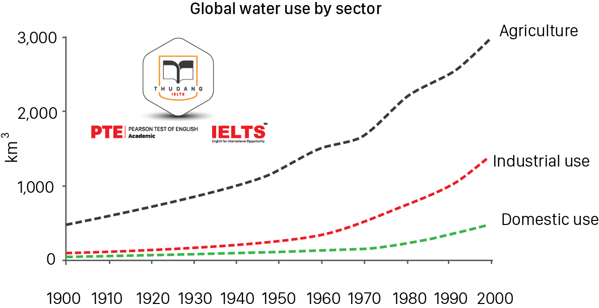
The line graph shows changes in water use for the whole world over a one hundred year period, split between three different sectors, while the table looks at just two countries – Brazil and the Democratic Republic of Congo – for the year 2000.
Over the one-hundred-year period, it is obvious that all three types of water use increased significantly, although none of them changed positions. Throughout the whole period, agricultural purposes required more water than any other, beginning at about 500km3 and soaring to more than 3,000km3 a century later. Industrial use was much lower, at about 100km3 in the year 1900, but also soared, finishing the period at about 1,500km3. Domestic use required slightly less water than industrial use at the beginning of the period, but grew to use around 500km3 by the millennium.
In the year 2000, Brazil had a population and area of irrigated land vastly larger than that of the Democratic Republic of Congo. Similarly, the amount of water used per person was more than forty times greater than that of the D.R. Congo.
Question 2
Answer
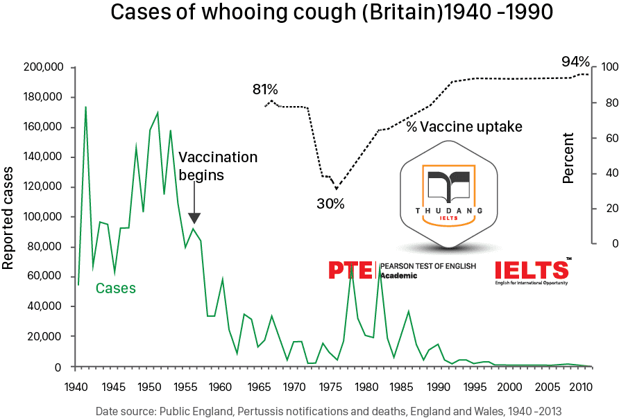
The line graph displays information about a disease called “whooping cough” in the United Kingdom over a fifty-year period, beginning in 1940. It charts the number of reported cases against the prevalence of vaccination programmes. It can be determined that instances of whooping cough declined after vaccination was introduced, rose again when it stopped, and then virtually disappeared when vaccination rates covered almost all of the population.
Prior to the introduction of whooping cough vaccinations in the United Kingdom, the number of cases fluctuated wildly between sixty thousand and a hundred and seventy thousand cases per year. From the first year of vaccination onwards, this number fell rapidly until whooping cough was nearly eradicated in the sixties and seventies. At this point, with the disease nearly vanquished, vaccination rates dropped to just thirty percent, causing a spike in the number of cases. As the vaccination programme restarted, whooping cough continued to be a problem until vaccinations covered almost all of the population, at which point the disease virtually disappeared. By the twenty-first century, there was only a negligible number of cases.
Note
This task was extremely complex and required an unusually long introduction. Because of that, I did not want to group my later descriptions into two paragraphs. I felt this would not leave enough room for a thorough and accurate description. As such, this is a rare case of a two-paragraph IELTS essay.
Question 3
You should spend about 20 minutes on this task
The diagram below shows how the Australian Bureau of Meteorology collects up-to-the-minute information on the weather in order to produce reliable forecasts. Write a report for a university lecturer describing the information shown below.

Answer
The process diagram presents information about how the Australian Bureau of Meteorology gathers, processes, and distributes information pertaining to the weather. There are three sources of data and three methods of forecasting information about the weather.
Initially, meteorological data is gathered from a network of satellites, radar stations, and drifting buoys. The satellites provide photos of the Earth from space, while information from the radar system and the satellites together produce a radar screen image. Finally, these two sources of information combine with the drifting buoys to produce a synoptic chart.
Each of these three types of data is then analysed in order to provide a weather forecast. Once the forecast has been decided upon by the meteorologists, the broadcast is prepared using a computer system. This is then delivered to the general public via three methods: TV newsreaders, radio broadcasts, and recorded announcements sent out over the phone system.
Question 4
You should spend about 20 minutes on this task
The plans below show a pulic park when it firts opened in 1920 and the same park today. Summarise the information by selecting and reporting the main features, and make comparisons where relevant |
Write at least 150 words.
Answer
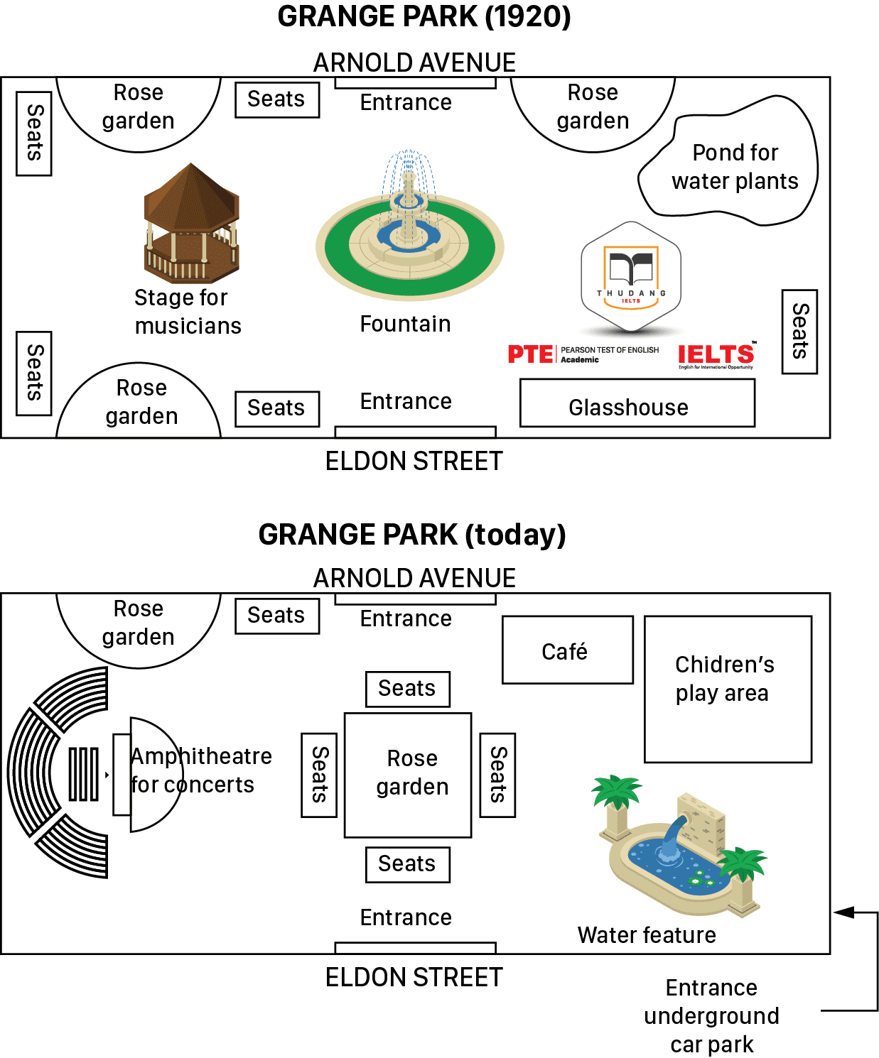
The two maps show images of a park approximately one hundred years apart. The park has changed almost entirely since it was first opened in 1920.
In 1920, the park had a fountain in the centre, and to the west of that was a stage for musicians. There were rose gardens in the north-west and south-west corners, as well as one in the north-east, next to a pond for water plants. In the south-east of the park there was a glasshouse. There were also seats located around the edges of the park.
Today, there is little that remains of the original features, except for the two entrances and one of the rose gardens. The fountain has been replaced by a central rose garden, which is surrounded by seats, and to the west there is now an amphitheatre. The water pond has made way for a children’s play park, and the nearby rose garden has been turned into a café.
Question 5
You should spend about 20 minutes on this task
The graph below show four countries of residence of overseas students in Australia.
Summarize the inforamtion by selecting and reporting the main features, and make comparisons where relevant.
Write at least 150 words.
Answer
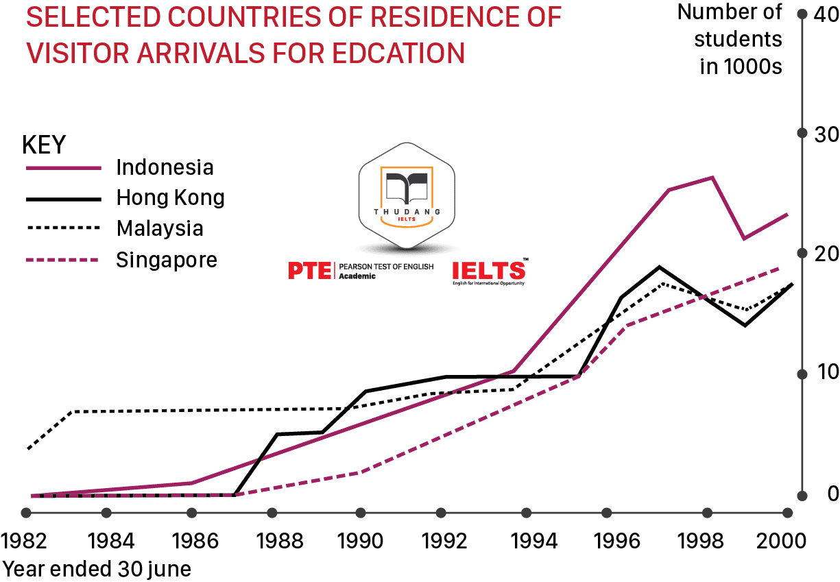
The line graph shows the number of students arriving in Australia from four different Asian countries. The number of students from each of these countries increased during the almost two-decade-long period, but at different rates.
In the first year listed on the graph, there was a higher number of students from Malaysia than the other three countries, with about five thousand Malaysian students visiting Australia. For approximately the first five years, this figure was far higher than that of the other three countries. While there were just under ten thousand Malaysian students, the other nations sent only about one thousand. From about 1986 onwards, however, the other countries began sending more students and these numbers rose faster than that of Malaysian students. By 2000, the final year on the graph, Malaysia sent fewer students than the other nations listed, despite having quadrupled from about five thousand to just shy of twenty thousand.
In contrast, the number of students from Hong Kong, Indonesia, and Singapore began to rise quickly in the mid- to late-eighties. Hong Kong rose suddenly, then levelled off, and then increased fitfully after that, while Indonesia sent more students at a steadily increasing rate until about 1998, when numbers dropped. Singapore followed a similar trend but without the sudden drop near the end.
Question 6
You should spend about 20 minutes on this task
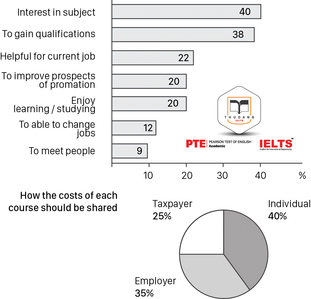
The charts below show the results of a survey of adult aducation. The first chart shows the reasons why adults decide to study. The pie chart shows how people think the costs of adult education should be shared.
Write a report for a university lecturer, describing the information shown below.
You should write at least 150 words.
Answer
There is a bar chart and a pie chart containing information taken from a survey on adult education. The bar chart describes why adults go into education and the pie chart shows who the respondents think should pay for it. People mostly go into education out of interest, and, perhaps unsurprisingly, it is believed that they should pay for it themselves.
According to the data, forty percent of adults go into education due to some sort of interest in a particular subject, while thirty-eight percent do it to gain qualifications. These are far and away the most common reasons, as the next most frequently cited reason was almost half this value. Several reasons were picked by about twenty percent of people, including the fact that it may help them earn a promotion at work. The least frequently stated answer was that adult education is a good way to meet new people.
The survey results showed forty percent of people believe the individual should pay the costs of a course. This matches quite well with the previous data, as the same percentage of people did these courses purely out of interest.
Question 7
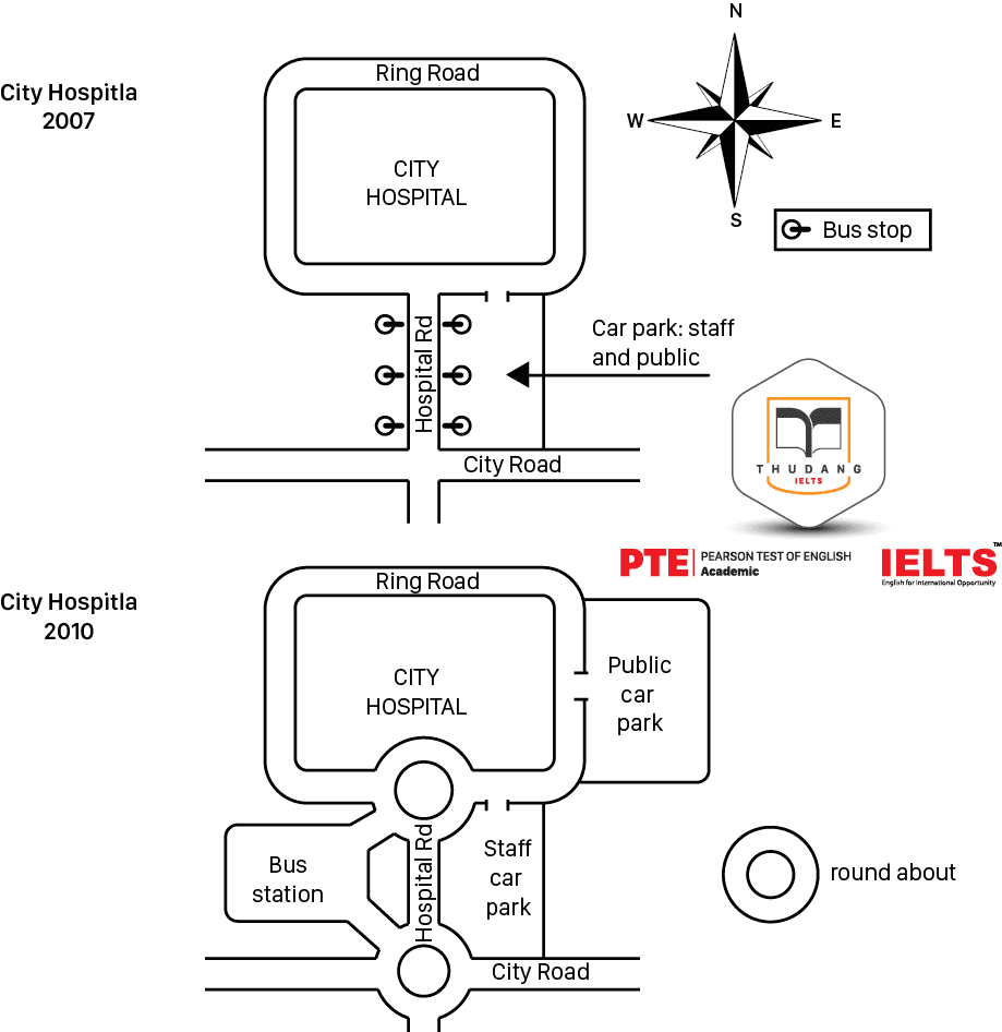
The two maps below road access to a city hospital in 2007 and in 2010,
Summarise the information by selecting and reporting the main features, and make comparisons where relevant.
Write at least 150 words.
Answer
The two maps depict the transportation facilities surrounding a city hospital in the years 2007 and 2010. Several changes took place during the intervening years.
In 2007, the hospital was accessible from the City Road via the Hospital Road, and this continued to loop around the hospital as the ring road. There were several bus stops alongside the Hospital Road, and a joint staff and public car park sat on the east side of road, with its access point just off the ring road.
By 2010, much had changed. The junction from the City Road to the Hospital Road had been converted to a roundabout, as had the junction connecting the Hospital Road with the ring road. The bus stops had been replaced by a bus station on the west side of the Hospital Road, while the joint staff and public car park had become a devoted staff car park. On the east side of the ring road, a new public car park had been built.
Question 8
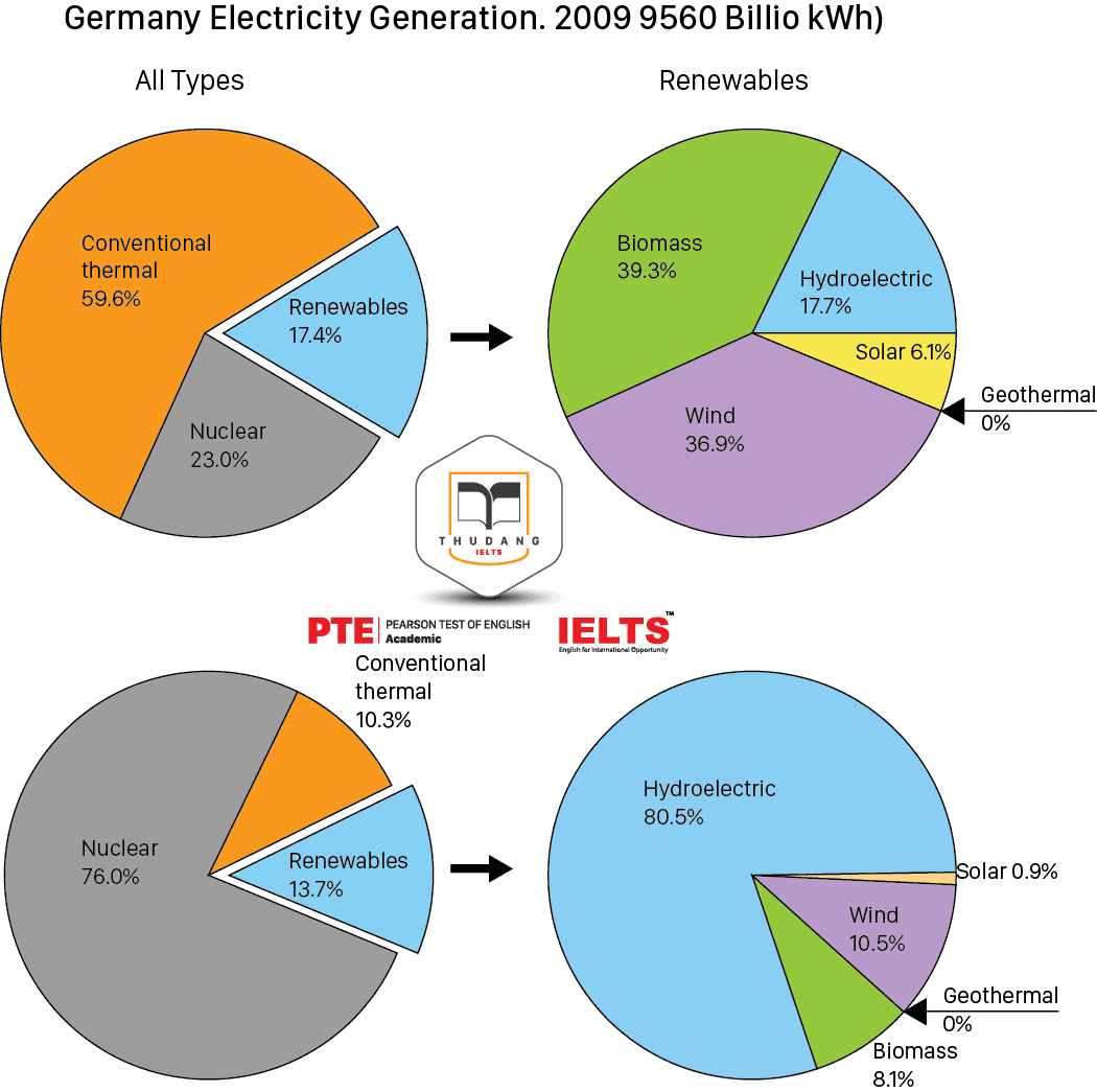
The charts below give information about the electricity generation in two countries in 2009.
Write at least 150 words.
Answer
There are four pie charts that give information about the generation of electricity in France and Germany in the year 2009. One set of charts looks at the total generation of electricity, while the other looks at how renewable forms of energy were produced. The two countries had roughly similar amounts of renewable energy, but these came from totally different sources.
Almost six tenths of Germany electricity came from conventional thermal sources, with almost a quarter coming from nuclear power. In France, however, about three quarters came from nuclear power and just a tenth came from conventional thermal. Both countries had similar figures for renewable sources – 17.4% for Germany and 13.7% for France.
In terms of different renewable energy sources, Germany relied primarily upon biomass, with forty percent of its renewable energy from that source, compared to less than a tenth for France. More than eighty percent of French renewables came from hydropower, compared to less than a fifth in Germany. About a third of German renewable energy came from wind, while the figure was just a tenth in France, and both countries produced very little solar power.
Question 9
You should spend about 20 minutes on this task
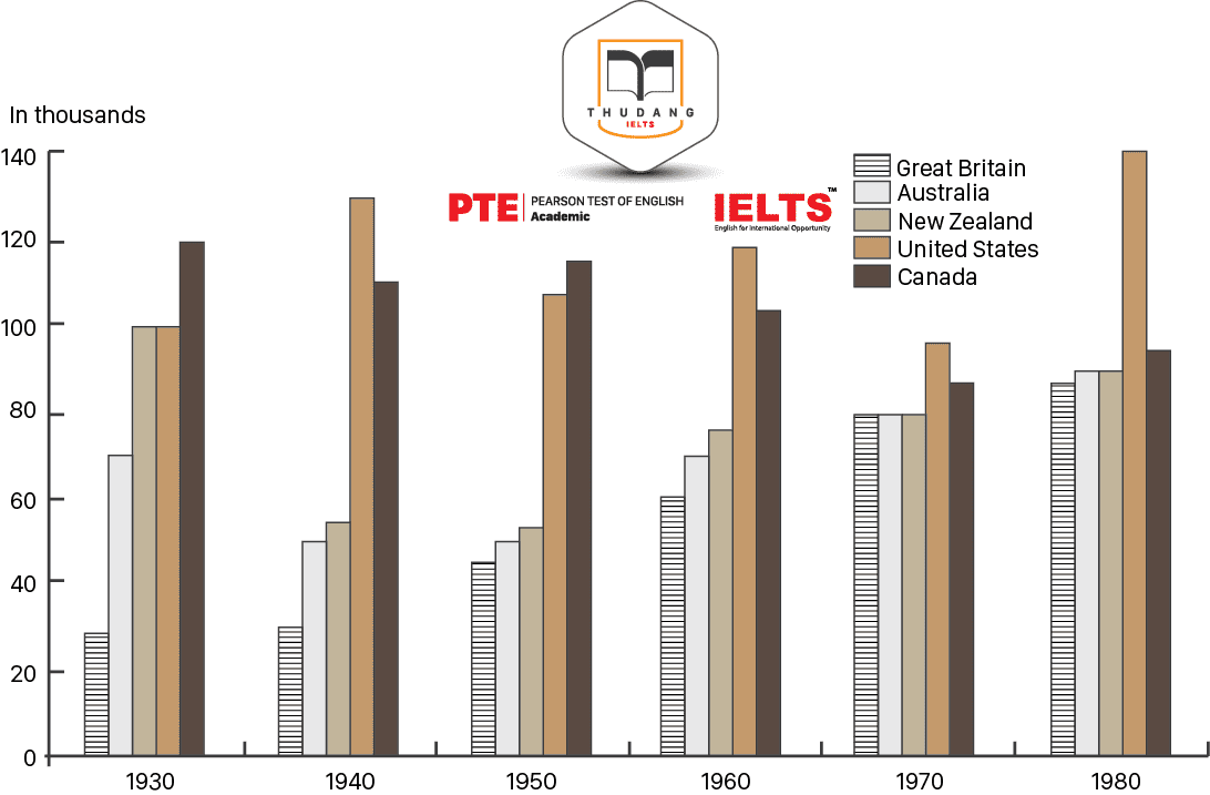
The table below shows the figures for imprisonment in five countries between 1930 and 1980.
Wrire a report for a university lecturer describing the information shown below.
You should write at least 150 words.
Answer
The bar chart gives information about the number of prisoners in five different countries over a period of fifty years, beginning in 1930. In each of the six different years recorded from this period, the United States and Canada had either the highest or second highest number of prisoners.
In more than half of the years recorded, the United States had the highest number of prisoners of these five countries, fluctuating between 100,000 and 140,000 inmates. During those two years when the United States did not have the highest numbers, Canada surpassed them. In 1930 and 1940, Canada had roughly 120,000 prisoners and the United States was second or joint-second with closer to 100,000 or 110,000 inmates.
The other countries tended to have far fewer people incarcerated, except New Zealand in the first year, when they had 100,000 people in prison, giving it the same number as the United States. After that, New Zealand’s figures fell in 1940, but rose continually until the end of the period. Australia followed the same pattern, reducing the number of prisoners between 1930 and 1940, but increasing it after that. The United Kingdom was similar but had a much lower total in 1930. Overall, the British prison population grew more than any other nation and leapfrogged Australia in the final year.
Question 10
You should spend about 20 minutes on this task
The fist chart below show the results of a survey which sampled a cross-section of 100,000 people asking if they travelled abroad and why they travelled for the period 1994 – 98. The second chart shows their destinations over the same period.
Write a report for a university lecturer descibing the information shown below.
You should write at least 150 words.
VISITS ABROAD BY UK RESIDENTS BY PURPOSE OF VISIT (1994-98) | |||||
| 1994 | 1995 | 1996 | 1997 | 1998 |
Holiday | 15,246 | 14,898 | 17,896 | 19,703 | 20,700 |
Business | 3,155 | 3,188 | 3,249 | 3,639 | 3,957 |
Visits to friends and relatives | 2,689 | 2,628 | 2,774 | 3,051 | 3,181 |
Other reasons | 982 | 896 | 1,030 | 1,054 | 990 |
TOTAL | 22,072 | 21,610 | 24,949 | 27,447 | 28,828 |
DESTINATIONS OF VISITS ABROAD BY UK RESIDENTS BY MAIN REGION (1994 – 98) | ||||
| Western Europe | North America | Other areas | Total |
1994 | 19,371 | 919 | 1,782 | 22,072 |
1995 | 18,944 | 914 | 1,752 | 21,610 |
1996 | 21,877 | 1,167 | 1,905 | 24,949 |
1997 | 23,661 | 1,559 | 2,227 | 27,447 |
1998 | 24,519 | 1,823 | 2,486 | 28.828 |
Answer
The first table contains information about why British people travelled abroad between 1994 and 1998, and the second shows where they went. It can be seen that people mostly went abroad on holiday, and that Western Europe was the predominant travel destination for Brits during these years.
In 1994, a little over 22,000 of the British people surveyed said that they travelled abroad, with about three quarters of those travelling for a holiday. The following year, the overall number of travellers dropped, but in each of the subsequent years the number grew so that in 1998 there were nearly 29,000 people travelling abroad. Once again, the vast majority of these people were going for their holidays, with slight growth in the number travelling for business, to visit friends or family, and other reasons.
In each of the years recorded, most people went to Western Europe. Nearly 20,000 people went to Western Europe in 1994, growing to nearly 25,000 in the final year of graph. No more than 2,500 people ever went to North America or any other area during those five years.
.png)
Thân mến,
IELTS THƯ ĐẶNG
 ĐĂNG KÝ KIỂM TRA ĐẦU VÀO - TƯ VẤN MIỄN PHÍ
ĐĂNG KÝ THI THỬ 2021
.png) ĐĂNG KÝ KHOÁ LUYỆN ĐỀ VÀ GIẢI ĐỀ IELTS
ĐĂNG KÝ KHOÁ LUYỆN ĐỀ VÀ GIẢI ĐỀ IELTS
.png) ĐĂNG KÝ KHOÁ IELTS TIẾP THEO ( Dành cho học viên IELTS - Thư Đặng)
ĐĂNG KÝ KHOÁ IELTS TIẾP THEO ( Dành cho học viên IELTS - Thư Đặng)