


IELTS THƯ ĐẶNG- TRUNG TÂM LUYỆN THI IELTS UY TÍN, CHẤT LƯỢNG TẠI HÀ NỘI
Tham khảo các bài liên quan:
>>> Kinh nghiệm luyện thi IELTS
>>> Hướng dẫn làm bài thi IELTS
Introduction
This collection of sample answers is intended to help you understand what is necessary in order to write a great essay. All of these answers have been written by a native speaker who is also a professional writer and IELTS trainer with more than ten years of experience.
It is important to note before we begin that these answers are not the only way to score band 9. Whether you study English, Korean, Arabic, Spanish, or any other language, it is important to note that there is more than one way to express yourself. If we gather 1,000 professional writers, they would produce 1,000 different IELTS essays.
The fifty answers in this book have been written in order to guide IELTS candidates to the most effective means of composing an essay. They show how to fulfil the requirements of the marking rubric without using overly complex language.
In fact, that is one of the most important things that you should remember. Accuracy and range are more important than using “difficult” language. The best way to approach IELTS writing is through common sense. You could broadly categorise any good approach to an IELTS essay like this:
1) Analyse the question
2) Structure your answer
3) Write your essay
4) Check your writing
Obviously, the hardest part is #3 because there is so much to consider. However, it is important to note that you do not need to achieve perfection in your essay. You just have to make it very good.
When it comes to structure, I always tell people to keep it simple. Do not try to reinvent the wheel. Every task 2 essay requires an introduction and conclusion, as well as two or three body paragraphs. Your structure should look like this:
1)Introduction
2)Body paragraph 1
3)Body paragraph 2
4) Conclusion
The contents of your body paragraphs will be determined by the requirements of the question. If it is “discuss both views” question, then your essay will devote one paragraph to one side of the argument and one paragraph to the other. This is also a great way to add balance to your essay – but remember that balance is not necessary. It is also acceptable to offer a strong argument.
For task 1, you have a little more freedom. You should write an introduction but what follows may be one or two or three paragraphs. It completely depends upon the information that you are presented with. However, you should note that a conclusion is not necessary.
The sample answers in this book should help you to understand the construction and execution of a very good IELTS essay. Do not think that these are the only ways to do it. They are intended as models to help you but ultimately the process of planning and writing an essay comes down to one person – you.
Question 11
You should spend about 20 minutes on this task
The graph below gives information about international tourist arrivals in different parts of the world.
Summarise the information by selecting and reporting the main features, and make comparisons where relevant.
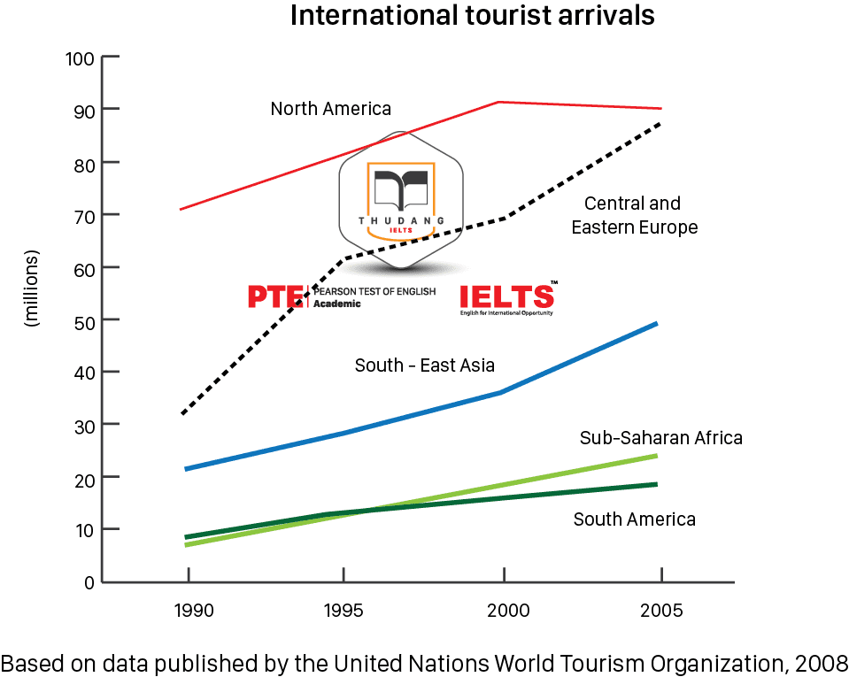
Answer
The line graph shows the number of international tourists arriving in five different regions. The chart records data from 1990 to 2005 and, in each of those years, North America received the highest number of tourists. However, in the final year it was a close tie between North America and Central and Eastern Europe, which had risen quite rapidly since the millennium.
In 1990, there were more than twice as many arrivals in North American as in the next most popular tourist destination, which was Central and Eastern Europe. The figures for North American continued to grow steadily until the turn of the century, after which they pulled back slightly. During the final five-year period, the number of arrivals was approximately 90 million. From 30 million in 1990, the number of arrivals to Central and Eastern Europe rapidly increased and ended the period at almost 90 million as well.
The figures for the other three regions were similar to those of Central and Eastern Europe in that they constantly increased, but they did so at a much less rapid rate. Southeast Asia saw a somewhat steady rise from 20 million to about 50 million, while Sub-Saharan Africa and South America followed a very similar trend to one another. They both grew from less than 10 million to very roughly 20 million.
Question 12
You should spend about 20 minutes on this task
The charts below show the average percentage in typical meals of three types of nutrients, all of which may be unhealthy if eaten too much.
Summarise the information by selecting and reporting the main features, and make comparisons where relevant.
You should write at least 150 words.
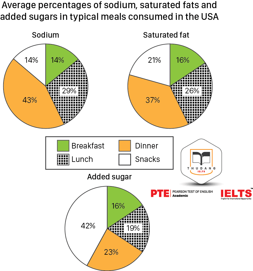
Answer
The three pie charts show information about three different kinds of nutrients and their prevalence in typical American meals. There are four kinds of meal mentioned, including snacks. The figures for sodium and saturated fat are loosely similar, but for added sugar they are quite different.
Sodium and saturated fat are both extremely common in typical American dinners. According to the pie charts, 43% of sodium is consumed at dinner time as well as 37% saturated fat, but just 23% of added sugar is found in American dinners. An American lunch is made up of almost a third sodium, more than a quarter saturated fat, and about a fifth added sugar. Breakfasts contain the least amount of these potentially unhealthy ingredients, at 14% sodium and 16% for both saturated fat and added sugar.
The figures for snacks look quite different. These are overwhelmingly comprised of added sugar, at a staggering 42%. These foods also contain 14% sodium and 21% saturated fat.
Question 13
The following bar chart shows the different modes of transport used to travel to and from work in one European city in 1960, 1980 and 2000.
Answer
The bar chart compares modes of transportation for people commuting to work in a European city. It looks at data from a forty-year period, beginning in 1960 and ending in 2000. There were significant changes during this time.
In 1960, the most popular means of getting to work was by walking, with nearly 35% of people choosing to go on foot. Similarly, a quarter of people chose to cycle to work. These methods were far more popular than taking a car, which only about 5% of people did.
These data saw a complete reversal over the next forty years, with walking and cycling falling in popularity, while driving skyrocketed to become the most common method of commuting. By 2000, the figures for these three methods had nearly inverted.
Buses, on the other hand, started and ended the period at around the same level, although they spiked in popularity in 1980, briefly being the chosen type of transport for about a quarter of people.
Question 14
You should spend about 20 minutes on this task
The mas below show the centre of a small town called l slip as it is now, and plans for its development.
Summarise the information by selecting and reporting the main features, and make comparisons where relevant.
You should write at least 150 words.
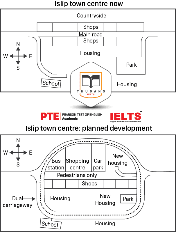
Answer
There are two maps, one of which shows Islip town centre at present and one which shows plans for its redevelopment. A great many changes are anticipated to take place.
Currently, Islip town centre is comprised of a main road that has shops along either side. There is housing behind the shops, and on the western edge of the main road there is a small side road leading to a school. To the east, another side road leads to a park.
The proposed changes completely reshape the landscape of Islip. Only half of the shops will remain, and the main road will be turned into a pedestrian walkway. On the northern side of what was once the main road, there will be a bus station, a shopping centre, a car park, and some new housing. The park in the east will be reduced in size and more new housing added, whilst perhaps the most notable change of all will be a large dual carriageway that will encircle the whole town.
Question 15
The bar chart below the percentage of Australian men and women in different age groups who did regular physical activity in 2010.
Summarise the information by selecting and reporting the main features, and make comparisons where relevant.
You should write at least 150 words.
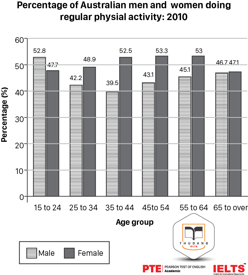
Answer
The bar chart shows data about exercise done by Australians in 2010. The information is categorized by age and gender, and it is clear that women do more physical activity than men in each age group except for the youngest.
In the youngest group, which shows data about people aged fifteen to twenty-four, the males are recorded as doing more exercise than the females, with 58.2% compared to 47.7% saying that they do regular physical activity. In the next age bracket, however, the percentage of men who exercise drops significantly to 42.2%, while the number of women rises slightly. The same trend takes place during the next age group as well, with the number of men exercising continuing to decline, and the number for women rising.
From the age of thirty-five onwards, the number of women exercising stays fairly steady, while the figures for men improve, until the final groups of men and women aged sixty-five and over. In this category, both men and women do far less physical activity, and their figures are very close, at 46.7% and 47.1% respectively.
Question 16
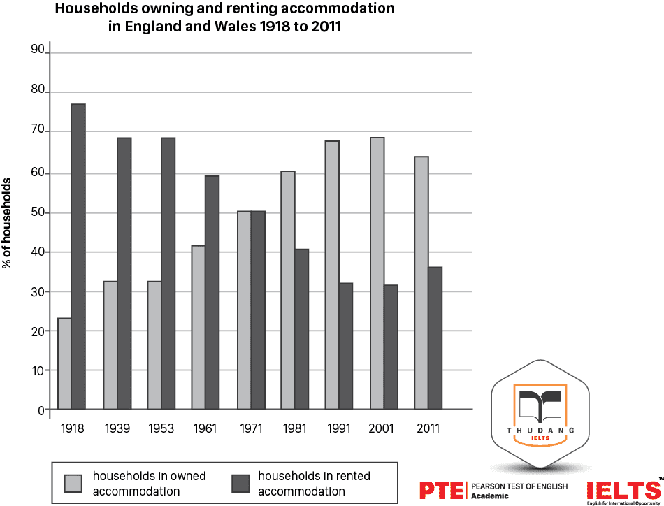
The chart below show the percentage of households in owned and rented accommodation in England and Wales between 1918 and 2011.
Summarise the information by selecting and reporting the mainfeatures, and make comparisons where relevant.
Answer
The bar chart shows the percentage of people in England and Wales who owned or rented their property over a period of nearly one hundred years, beginning in 1918 and ending in 2011. The data is inversely correlated, meaning that as the number owners increased, the number of renters decreased.
In 1918, accommodations were overwhelmingly rented, with nearly 80% of people renting their homes rather than owning them. Twenty years later, this figure had dropped to less than 70% of people, and there was no change over the next decade and a half.
From 1961 onwards, the percentage of people owning a home exploded, while the number of renters went into free fall. For thirty years this trend continued, until around the millennium it slowed down, and finally began to reverse in 2011. Between 2001 and 2011, the percentage of homeowners decreased for the first time in more than a half century.
Question 17
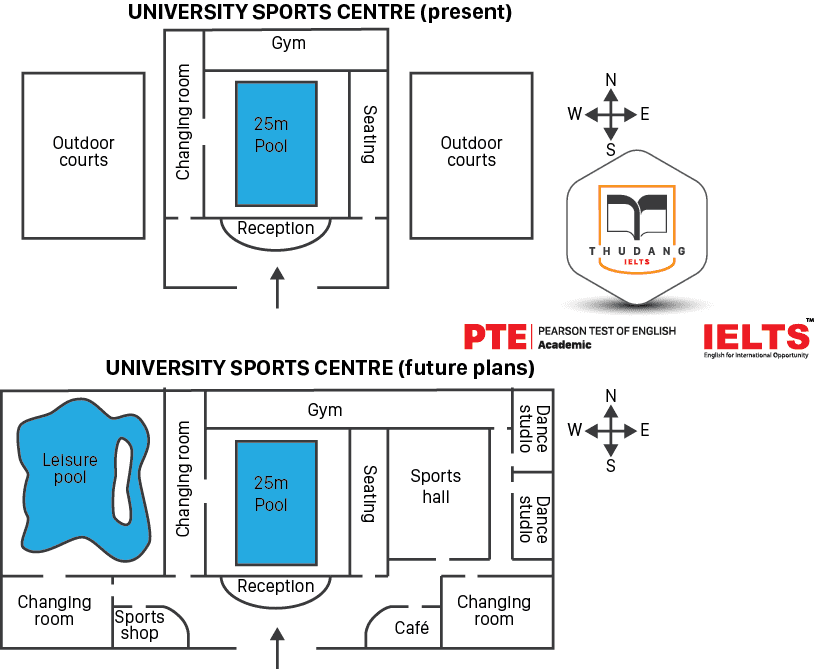
The plans below show the layout of a university’s sports centre now, and how it will look after redevelopment.
Summarise the information by selecting and reporting the main features, and make comparisons where relevant.
You should write at least 150 words.
Answer
There are two maps depicting a university sports centre before and after a period of redevelopment. There are some parts that will remain the same and others that will be completely altered, and the total area of the sports centre will be increased significantly.
At the centre of the sports centre is a 25-metre swimming pool, surrounded by a seating area and a changing room, with a reception desk between it and the entrance. These features have not changed between the first map and the second. However, the gym, which sits behind the swimming pool, has been substantially expanded, and in the second map it is approximately twice the size it originally was. To the east of the gym, two dance studios have been added in the second map, and to the west there is now a large leisure pool. At the front of the building, near the reception, there are two additional changing rooms, as well as a sports shop and café.
Question 18
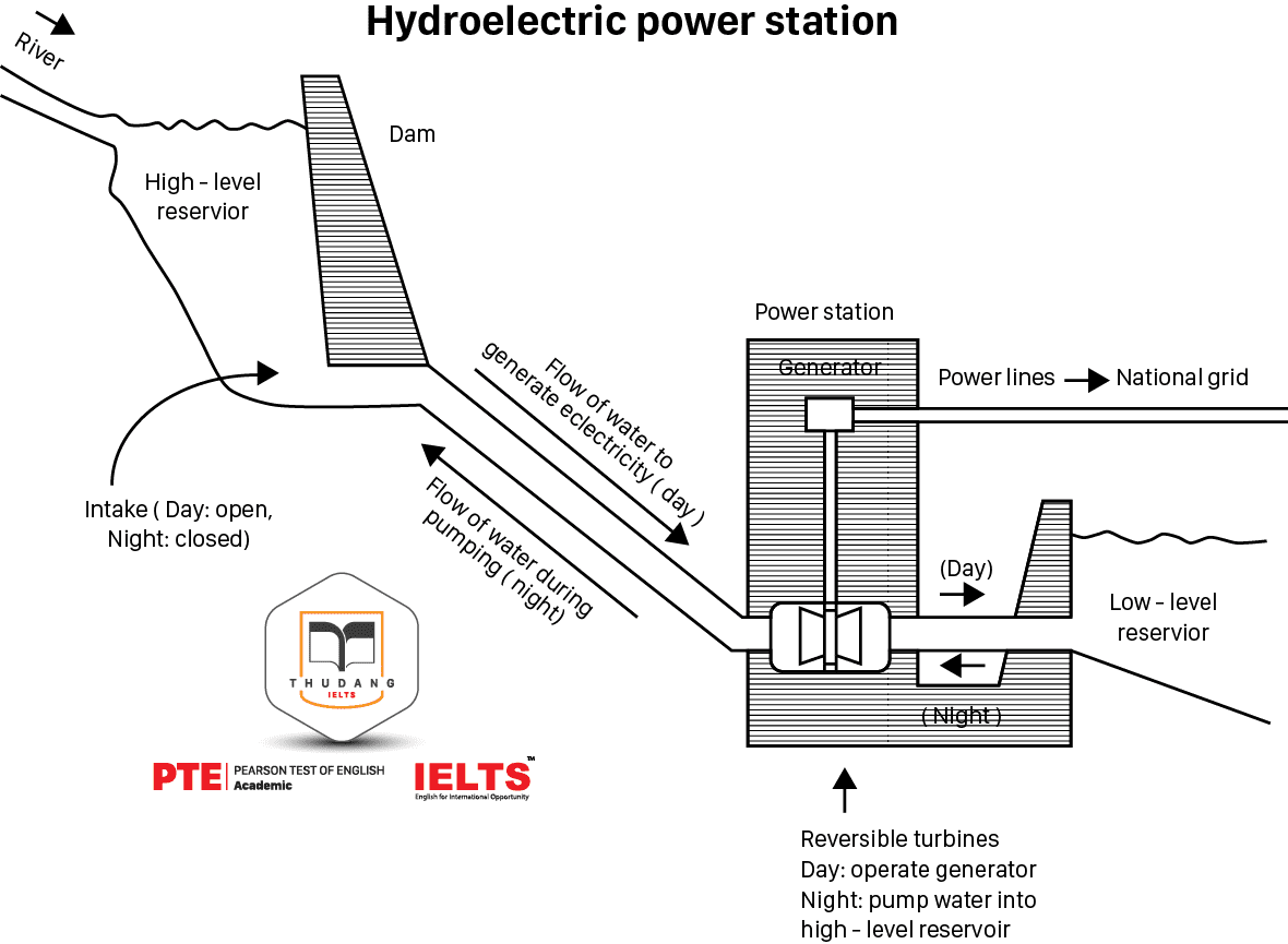
The diagram below shows how electricity is generated in a hydroelectric power station.
Summarise the information by selecting and reporting the main features, and make comparisons where relevant.
You should write at least 150 words.
Answer
The diagram depicts a hydroelectric power station, and shows how electricity is generated by the flow of water through a dam and other component parts. Ultimately, water flows from one reservoir to another, producing electricity that is sent to the national grid.
Firstly, water enters a reservoir from a river. The water is held back from its natural course by a dam, underneath which there is an intake pipe that is open during the day and closed at night. During the daytime, water flows down, via gravity, to the power station, which is housed below the dam. In the power station, the flowing water spins a generator, which produces an electrical current that is then distributed via power lines to the national grid.
Once the water has generated this electricity, it flows into a lower reservoir, but at night it is pumped back up through the system to the upper reservoir, ready to begin the process again the following day.
Question 19
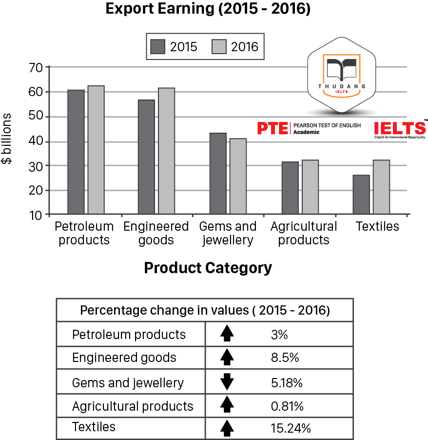
The chart below shows the value of one country’s exports in various categories during 2015 and 2016. The table shows the percentage change in each category of exports in 2016 compared with 2015.
Summarise the information by selecting and reporting the main features, and make comparisons where relevant.
You should write at least 150 words.
Answer
The chart and table give information about exports in five different categories during two years. The chart shows the total earnings from exports, while the table shows the changes in terms of percentage from one year to the next.
This country’s main export was petroleum products, which were valued at a little over $60 billion in 2015, and rose 3% over the next year. The next most valuable export was engineered goods, which were worth about $57 billion in 2015, and more than $60 billion by the following year. Their growth between 2015 and 2016 was 8.5%.
The next three categories of exports were worth far less. Gems and jewellery were worth almost $45 billion in 2015, but actually fell 5.18% by the next year. It was the only type of export to drop during these two years. Agricultural products grew from one year to the next, but only 0.81%, while lowest valued export, textiles, saw the biggest jump – 15.24% between 2015 and 2016.
Question 20
The diagram illustrates the volume of electricity produced and consumed in ten countries in 2014.
You should write at least 150 words.
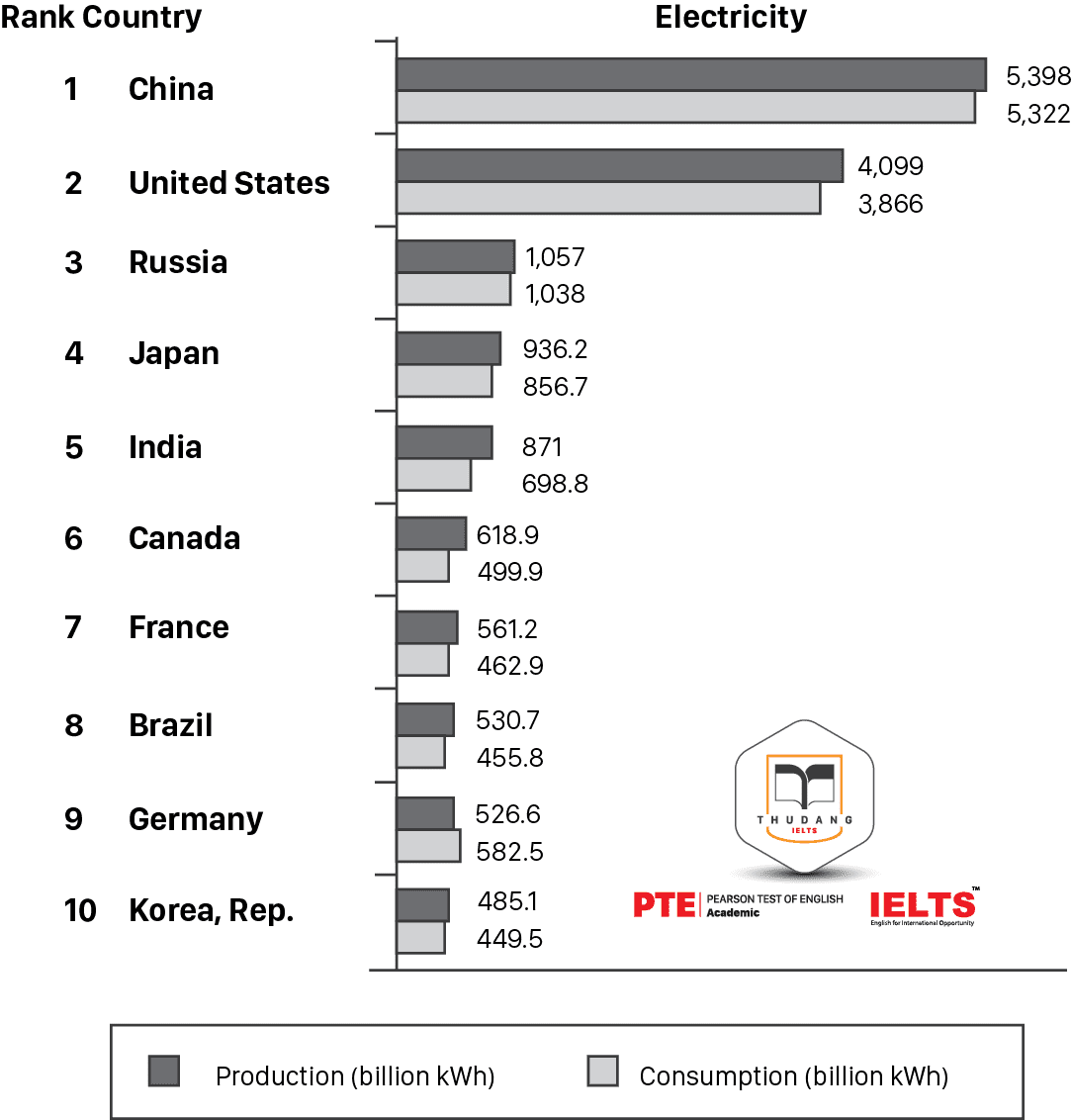
Answer
The bar chart shows the amount of electricity that was produced and used in ten different countries in 2014. It is clear that China both produced and consumed the most electricity, while South Korea produced and consumed the least.
Of the ten countries, two were runaway leaders in the production and consumption of electricity. First was China, which surpassed five trillion kWh in both categories, and next was the United States, which produced a little over four trillion and used a little less than four trillion kWh. This was about four times the amounts registered by the next country on the list, Russia, which was at about one trillion for production and consumption. Every other country on the list generated and used less than one trillion kWh of electricity.
Every country on the list produced more electricity than they used except for Germany, which used slightly more. They consumed 582.5 billion kWh of electricity, and only generated 526.6 kWh.
.png)
Thân mến,
IELTS THƯ ĐẶNG
 ĐĂNG KÝ KIỂM TRA ĐẦU VÀO - TƯ VẤN MIỄN PHÍ
ĐĂNG KÝ THI THỬ 2021
.png) ĐĂNG KÝ KHOÁ LUYỆN ĐỀ VÀ GIẢI ĐỀ IELTS
ĐĂNG KÝ KHOÁ LUYỆN ĐỀ VÀ GIẢI ĐỀ IELTS
.png) ĐĂNG KÝ KHOÁ IELTS TIẾP THEO ( Dành cho học viên IELTS - Thư Đặng)
ĐĂNG KÝ KHOÁ IELTS TIẾP THEO ( Dành cho học viên IELTS - Thư Đặng)