


IELTS THƯ ĐẶNG- TRUNG TÂM LUYỆN THI IELTS UY TÍN, CHẤT LƯỢNG TẠI HÀ NỘI
Tham khảo các bài liên quan:
>>> Kinh nghiệm luyện thi IELTS
>>> Hướng dẫn làm bài thi IELTS
IELTS Writing Target 9 Band Essays is a Target 9 Band Essays samples to help you get familiarised with the format of IELTS Writing band 9 essays.
PART 2
11.The two pie charts below show the percentages of industry sectors' contribution to the economy of Turkey in 2000 and 2016. Summarize the information by selecting and reporting the main features and make comparisons where relevant.
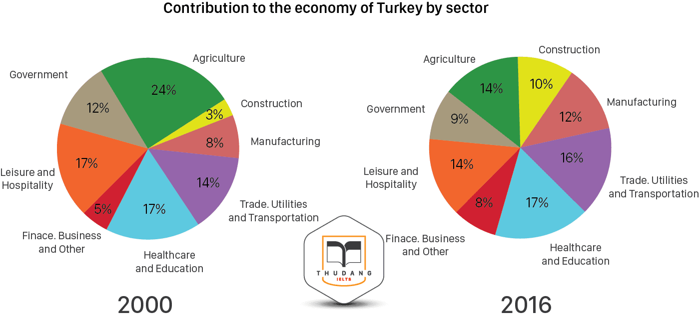
Sample answer: The two pie charts illustrate how different industrial sectors contributed to the economy of Turkey percentage wise in the years 2000 and 2016. Overall, at the beginning of the period construction contributed the least to the economy of Turkey and agriculture was the most significant economic sector. In comparison, at the end of the period healthcare and education became the largest economic segment and the lowest contribution was made by financial, business and other services. To begin with, construction sector accounted for 3% of Turkey's economy in 2000, and experienced a more than threefold increase to one-tenth in 2016. Economic income from trade, utilities and transportation was 14% in 2000 and witnessed a slight growth of 2% in 2016. At the beginning of the period, manufacturing and finance, business and other services made up 8% and 5% of Turkey's economy, respectively, and these figures rose to 12% and 8% in 2016. Further analyzing the charts, it can be noticed that agriculture, which comprised almost a quarter of Turkey's economy in 2000, fell to 14% in 2016. In 2000 economic outputs from government and leisure and hospitality sectors were at 12% and 17%, respectively, and both decreased by 3% after 16-year period. In contrast, contribution from healthcare and education sector remained constant in both years at 17%. |
12. The pie charts below show exports from various EU countries to India and China in 2005 and 2015. Summarize the information by selecting and reporting the main features, and make comparisons where relevant.
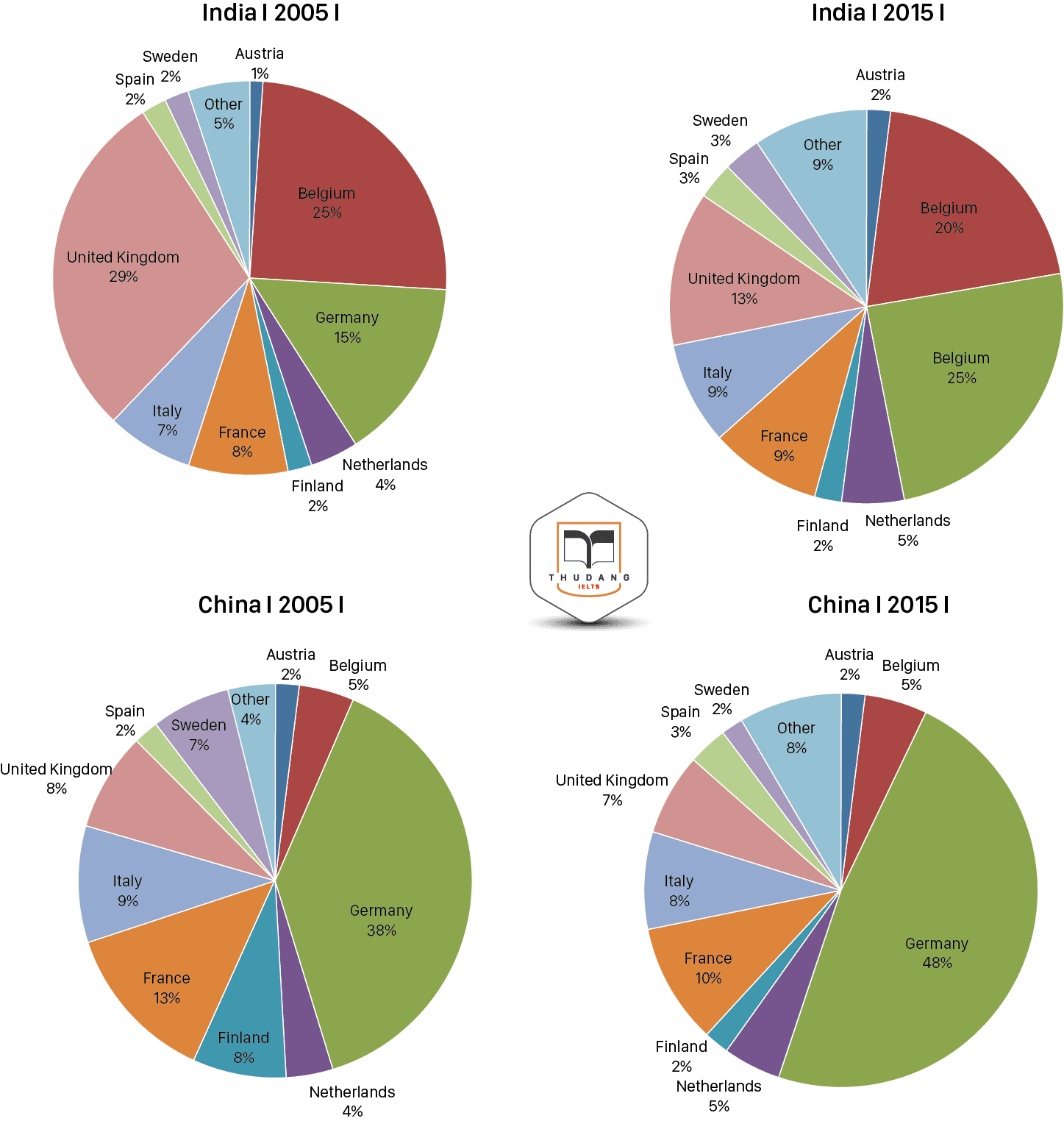
Sample answer: The given pie charts elucidate changes in exports patterns from EU countries to India and China between 2005 and 2015. Overall, it is clear that Germany emerged as the major Exporter to both India and China. Meanwhile share of other countries as far as export is concerned, either declined or remained unchanged. To begin with, as far as India is considered, in 2005, the UK was the biggest exporter which exported 29% goods, followed closely by Belgium, 25%, and Germany, 15%. while exports to China in 2005 were overwhelmingly dominated by Germany, 38% followed by a distant France, 13%. Other countries, however, had less than 10% each to both the nations. Further analyzing the graph, from 2005 to 2015, situation changed drastically in case of exports to India, as the share significantly fell by more than half to 13%; that of Belgium also fell by 5%, and Germany surpassed both the UK and Belgium to 25%. Exports from other countries stayed stable. Exports to China, though, did not witness much change, except that the share of Germany rose further by 10% to 48%, while French export share fell by 3%.
|
13. The table below shows the number of medals won by the top ten countries in the London 2012 Olympic Games. Summarise the information by selecting and reporting the main features, and make comparisons where relevant.
Rank by Gold | Country | Gold | Silver | Bronze | Total |
1 | United States | 46 | 29 | 29 | 104 |
2 | China | 38 | 27 | 23 | 88 |
3 | Great Britain | 29 | 17 | 19 | 65 |
4 | Russia | 24 | 26 | 32 | 82 |
5 | South Korea | 13 | 8 | 7 | 28 |
6 | Germany | 11 | 19 | 14 | 44 |
7 | France | 11 | 11 | 12 | 34 |
8 | Italy | 8 | 9 | 11 | 28 |
9 | Hungary | 8 | 4 | 5 | 17 |
10 | Australia | 7 | 16 | 12 | 35 |
Sample answer: The table illustrates performance of top ten nations which were successful in London Olympic competition held in 2012 by showing their medal tally. Overall, it is clear that the United States topped the list while Hungary had the least number of medals in this Olympic Games. According to the presentation, countries were ranked on the basis of the number of gold medals they obtained in the competition where the USA won greatest number of medals overall with the medal haul of 104. They won more gold medals than silver and more medals than any other country in both categories. China stood second in terms of medals at 88, and like the USA, they too won fewer silver medals than gold medals. While Russia’s silver medal total was better than Great Britain’s, they did not do as well as the host nation in terms of gold medals, winning just 24. In fact Great Britain had a lower overall medal tally than Russia but still they were placed third. Similarly, Germany was significantly more successful at winning medals than South Korea, with a total of 44 compared to South Korea’s 28, but because South Korea won two more gold medals than Germany they were ranked higher. Australia had the least ranking in this group by winning only seven gold and sixteen silver medals.
|
14. The table below gives information about the underground railway systems in six cities. Summarize the information by selecting and reporting the main features , and make comparisons where relevant.
City | Date opened | Kilometers of route | passengers per year ( in millions) |
London | 1863 | 394 | 775 |
Paris | 1900 | 199 | 1191 |
Tokyo | 1927 | 155 | 1927 |
Washington DC | 1976 | 126 | 144 |
Kyoto | 1981 | 11 | 45 |
Los Angeles | 2001 | 28 | 50 |
Sample answer: The table gives information on the underground railway systems in terms of the routes covered, passengers travelling annually and the year the railway system was initiated in six cities across the globe Overall , it is clear that two of the oldest systems are London and Paris but these are Paris and Tokyo that have a large number of passengers travelling annually. Meanwhile, London has the largest route travelled. As per the table, the oldest underground railway service provider is in London, opened in 1863 and it also covers the longest rail route of 394 km. Paris comes at second place which was inaugurated in 1900. In terms of the size of the railway systems, London is nearly twice that of Paris but the congestion in terms of travelers is more at the later which falls at second place with 1191 million passengers yearly. Interestingly, Tokyo, which has only 155 kilometers of track, serves the greatest number of passengers per year, at 1927 million commuters. These are then followed by the opening of the railway systems in Washington DC, Kyoto and Los Angeles. The latest built station is in Los Angeles which started to operate in 2001 and covers significantly smaller railway route than the others of mere 28 km. Kyoto, which was built two decades before the Los Angeles station has the smallest system comprising of only 11 kilometers. Kyoto and Los Angeles both serve the least number of passengers per year with 45 and 50 million respectively which is about one third of Washington DC and comparatively very lower than the others.
|
15. The table below gives information on internet use in six categories by age group. Describe the information in the table and make comparisons where appropriate.
Internet Activities by Age Group
| Age Group | ||||||
Activity % | Teens | 20s | 30s | 40s | 50s | 60s | 70+ |
Get News | 76 | 73 | 76 | 75 | 71 | 74 | 70 |
Online games | 81 | 54 | 37 | 29 | 25 | 25 | 32 |
Downloads | 52 | 46 | 27 | 15 | 13 | 8 | 6 |
Product research | 0 | 79 | 80 | 83 | 79 | 74 | 70 |
Buying a product | 43 | 68 | 69 | 68 | 67 | 65 | 41 |
Searching for people | 5 | 31 | 23 | 23 | 24 | 29 | 27 |
Sample answer: The given tabular chart illustrates the information about the usage of internet by people of different ages for various purposes. Overall, people have different preferences towards online activities where getting news and buying products are done by all age groups. Teenagers mostly download and play games online while matured people show interest in searching and purchasing products online. To begin with, it can be seen that watching news online has maximum popularity among all age groups with at least 70% of people using internet to get news. In addition to this, 81% of teens play online games and this number drop to 54% in 20s and 37% in 30s, and then keep on decreasing till 60s up to 25%. Online games are increased by 7% in age group of above 70s. Moreover, downloads activity display a similar trend like internet games, but they are less popular in general and decline markedly with people over age of 40. Only 6% of people over 70 indulge in it. Moving further, maximum product related research has been done by 83% people of 40s.While, teens do not use internet for research work. Apart from this, buying a product online in equally popular among all internet users except those at either end of age scale that is teens and internet users of age 70 or older. Searching people, meanwhile, is the least popular activity with the figure remaining between 23% and 31% in all the age categories with the exception of teens whose proportion is mere 5%. |
16. The table below shows how many tourists from five countries visited Australia in different years from 1991 -1999. (unit: thousands)
Country of Residence | 1991 | 1993 | 1995 | 1997 | 1999 |
United states | 259 | 267 | 288 | 310 | 393 |
Canada | 51 | 48 | 55 | 61 | 75 |
Unites Kingdom | 258 | 302 | 335 | 388 | 509 |
Germany | 75 | 102 | 120 | 125 | 140 |
Other Europe | 172 | 200 | 259 | 319 | 389 |
Sample answer: The table illustrates the changes in the number of people travelling to Australia from some countries worldwide over the 1990s. Overall, it is clear that the figures for visitors to Australia from all these countries witnessed significant increase over the decade. Mostly, Americans and Briton preferred to visit Australia over the five given years. To begin with, it can be seen that the biggest rise was seen in visitors from other countries in Europe, which was more than double over the period from 259 thousand to 393 thousand. Noticeably, the largest number of tourists in total came from the United Kingdom, which went up from 258 to 509 thousand. Visitors from the United States also experienced a similar upward trend over the decade. Meanwhile, there were considerably fewer travelers from Canada, although the figure grew over the same period from 51,000 to 75,000, with most of the increase occurring in the second half of the decade. There were almost as many visitors from the United Kingdom as from all of the other European countries, including Germany. However, by 1999 there had been nearly as many tourists from the other European countries as from the United States.
|
17. The graphs below show three exports from South East Asia and the four sources of revenue for 1970 and 1995. Write a report for a university lecturer describing the information shown below.
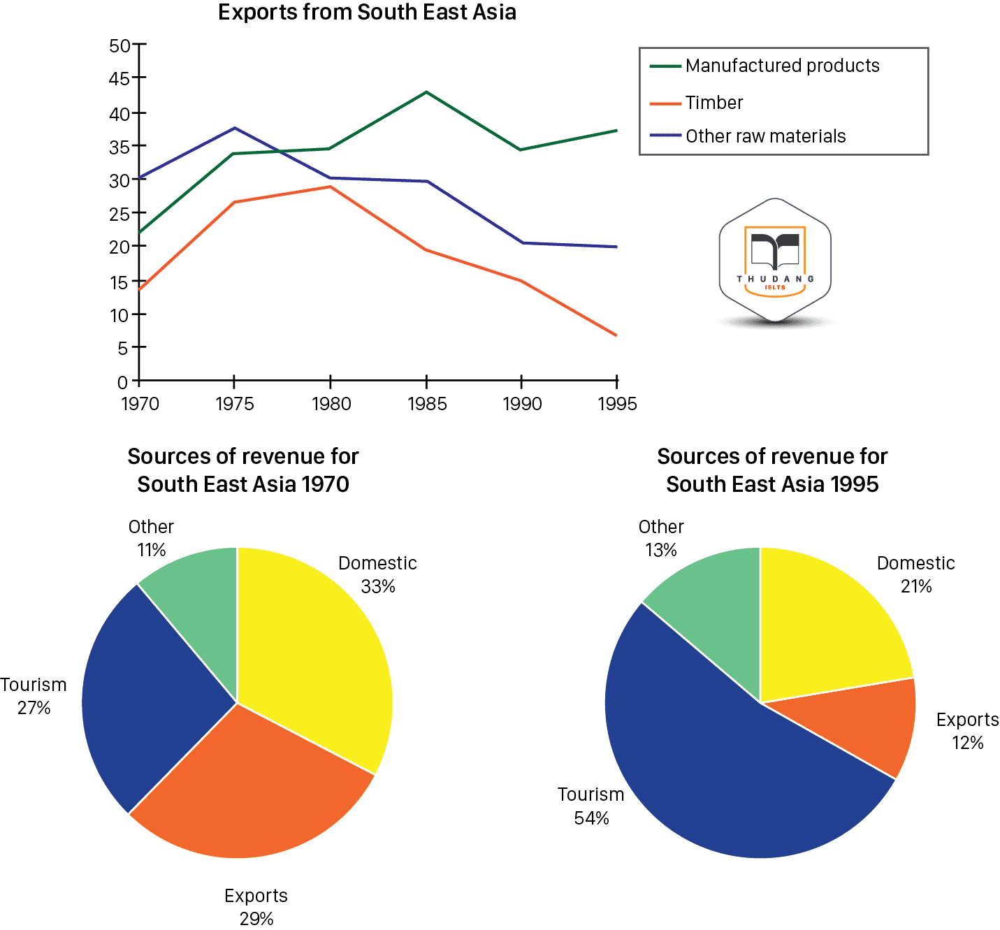
Sample answer: The line graph illustrates the profits of three kind of exports from South East Asia between 1970 and 1995, while the pie charts give information about four sector that produced money for South East Asia in 1970 and 1995. Overall , it is clear that manufactured products were the only goods which experienced a rise in number during the given period. Meanwhile, the sources of revenue showed a considerable change over the years. According to the line graph, all exported items witnessed a fluctuation. In the first year, raw materials placed as the highest commodities sent with the total of 30 millions dollars, followed by manufactured products and timber, which accounted for about 22 and 15 millions dollars respectively. Five years later, all commodities rose in amount. However, starting from 1975, raw materials dropped moderately until hiring only 20 million US dollars in 1995. Similar to the decline received by the raw materials, the amount of timber reduced noticeably, despite the slight incline in 1980; becoming the least exported commodity in 1995. In contrast, the number of manufactured products tended to climb up until reaching its peak in 1985 with above 40 million dollars. Inspite of the fact that the products decreased in 1990, it still remained as the most exported items in the end of the period Turning to the chart, the sources of revenue changed over the years. In 1970, the biggest revenue was domestic with 33% followed by exports and tourism, and other as the least revenue with only 11% of the total percentage. Meanwhile, 25 years later, tourism became the biggest revenue with more than half of the portion. In contrast, exports dropped the figure by 16%, sitting as the least revenue for the SEA countries in the end of the time frame.
|
18. The pie chart shows the percentage of women in poverty and the bar chart shows poverty rates by sex and age. They are from the United States in 2008. Summarize the information by selecting and reporting the main features and make comparisons where relevant.
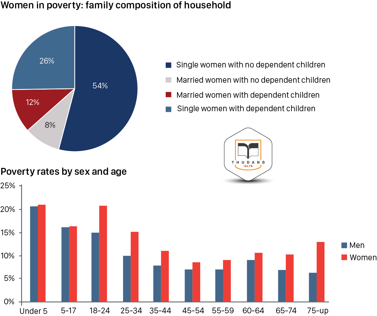
Sample answer: The pie chart gives information about the proportion of females considered in poverty while the bar chart Overall, it is clear that single women constituted the biggest proportion of females in poverty. Also, more women than men regardless the age were in poverty in the given year. To begin with, women with no dependent children made up the largest group with more than a half of females in poverty. Following this, were single women with dependent children which accounted for just over a quarter of the impoverished females. The remaining percentages were represented by married women with and without children at 12% and 8% respectively. Concerning the poverty rates by age and gender, there was a noticeable difference between the age categories. Persons aged less than 24 years old suffered the most with figures between 15% and 20% for both genders, although the percentage of women was always slightly higher than that of men. On the other hand, women aged between 35 and 74 years old and men aged more than 25 were less affected with less that 10% living in poverty.
|
19. The charts below shoes one government’s spending on culture ad education in 1995 and 2005 and the number of people participating in Arts events in the same year. Summarize the information by selecting and reporting the main features and make comparisons where relevant.

Sample answer: The given data represents one governments outcome on culture and education between 1995 and 2005 and the rate of people participating in arts events in the same years. Overall, most number of people attended musical events and less number of people showed interest to participate in events related to literature. Therefore, the government spent highest amount of money on music and lowest sum of money at literature related functions during these years. At the first graph, there were 4 types of education and it can be clearly seen that there were significant changes in each category from 1995 to 2005. In the year 1995, music was the biggest portion than others and was almost a half of the total. The following portions were visual arts and theater in which theater was slight different of its portion with visual arts. Lastly with small slice was literature. In 2005, however, both theater and music had similar portion, it was not more than third-fourth each. Moreover, visual arts and literature had similar part and if both were calculated, then the total of portions would not similar as theater. Turning at the second graph, there was a dramatic rise in all types of arts events (except visual arts). In fact, the highest number of people joined particular event was music in the year 1995 and 2005, about 125,000 and 150,000 respectively. The second biggest one was theater where in both years were just under 100,000. Visual arts and literature, however, were not over than 50,000 of participants. From 1995 to 2005, the total of participants decreased slightly. |
20. The chart below shows the amount of money (in pence) per week spent on fast foods in Britain in 1990. The graph shows the trends in consumption of fast foods. Write a report for a university lecturer describing the information shown below.
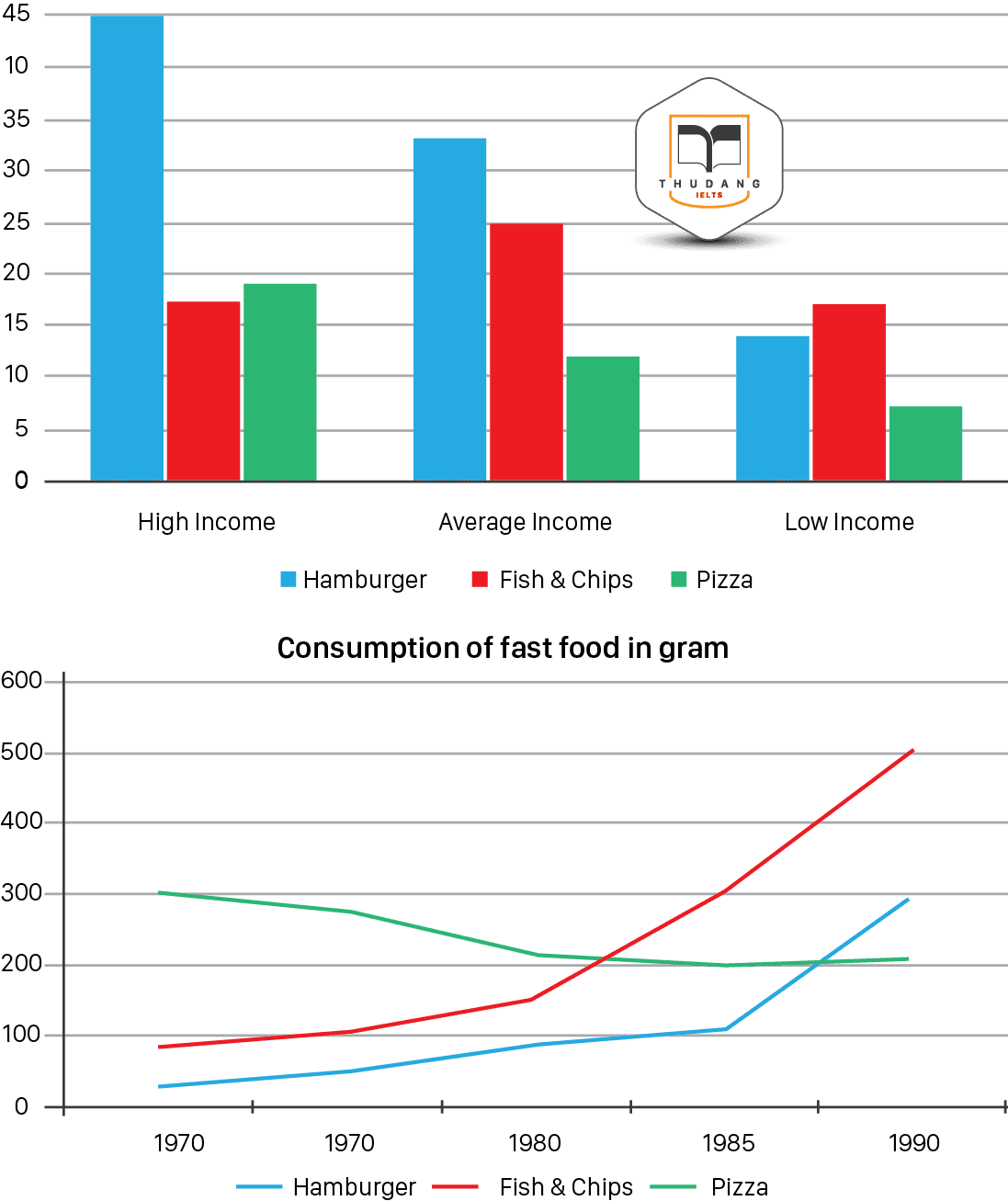
Sample answer: The bar chart compares weekly expenditure of the British on three fast food items in pence during 1990 while the line graph shows the consumption of these items from 1970 to 1990. Overall, expenditure on fast food varied on the basis of people’s income and most of the high and average income level persons preferred to eat hamburger. Although, pizza was the most consumed item in 70’s but in later years, consumption of fish & chips increased remarkably. To begin with the bar chart, it can be seen that high income earners spent more money on hamburgers than the other income groups, spending more than twice (43 pence per person per week) than on fish and chips or pizza ( both under 20 pence). Average income earners also favored hamburgers, spending 33 pence per person per week, followed by fish and chips at 24 pence. Low income earners appeared to spend less than other income groups on fast foods, though fish and chips remained their most popular fast food, followed by hamburger and then pizza. Turning to the line graph, it can be noticed that in 1970 fish and chips were twice as popular as burgers, pizza being at that time the most favorite fast food (300 gram / person). The consumption of hamburgers and fish and chips rose steadily over the 20 year period and in 1990 fish and chips were the most consumed fast food item whose consumption increased more than five times( to 500 gram/ person) compared with the starting year. Meanwhile, the consumption of pizza followed a declining trend over the same period with a slight increase in popularity after 1985. |
Còn tiếp…..!
.png)
IELTS THƯ ĐẶNG CHÚC BẠN THI TỐT!
Thân mến,
THƯ ĐẶNG
 ĐĂNG KÝ KIỂM TRA ĐẦU VÀO - TƯ VẤN MIỄN PHÍ
ĐĂNG KÝ THI THỬ
.png) ĐĂNG KÝ KHOÁ LUYỆN ĐỀ VÀ GIẢI ĐỀ IELTS
ĐĂNG KÝ KHOÁ LUYỆN ĐỀ VÀ GIẢI ĐỀ IELTS
.png) ĐĂNG KÝ KHOÁ IELTS TIẾP THEO ( Dành cho học viên IELTS - Thư Đặng)
ĐĂNG KÝ KHOÁ IELTS TIẾP THEO ( Dành cho học viên IELTS - Thư Đặng)